Casilla a seleccionar
Una casilla de selección es un tipo de botón utilizado para introducir o mostrar datos binarios (verdadero-falso). Fundamentalmente, está marcado o desmarcado, pero se puede definir un tercer estado.
Las casillas de selección se controlan por métodos o acciones estándar. El método asociado a ella se ejecuta cuando se selecciona la casilla de selección. Como todos los botones, la variable de la casilla de selección se pone en 0 cuando se abre el formulario por primera vez.
Una casilla de selección muestra el texto junto a un pequeño cuadrado. Este texto se define en el área Título del tema "Objetos" de la Lista de propiedades. Para introducir en esta área un título en forma de referencia XLIFF (ver Anexo B: arquitectura XLIFF).
Utilizar casillas de selección
Una casilla de selección puede asociarse a una variable o expresión de tipo entero o booleano.
- entero: si la casilla está marcada, la variable tiene el valor 1. Cuando no se marca, tiene el valor 0. Si la casilla de selección está en tercer estado (ver más abajo), tiene el valor 2.
- booleano: si la casilla está marcada, la variable tiene el valor
True. Cuando no se marca, toma el valorFalse.
Una parte o todas las casillas de selección de un formulario pueden estar marcadas o desmarcadas. Las casillas de selección múltiples permiten al usuario seleccionar varias opciones.
Casilla de selección de tres estados
Los objetos casilla de selección con el estilo de botón Normal y Plano aceptan un tercer estado. Este tercer estado es un estado intermedio, que generalmente se utiliza para fines de visualización. Por ejemplo, permite indicar que una propiedad está presente en una selección de objetos, pero no en cada objeto de la selección.

Para activar este tercer estado, debe seleccionar la propiedad Tres estados.
Esta propiedad solo está disponible para casillas de selección regulares y planas asociadas a variables o expresiones numéricas — las casillas de selección para expresiones booleanas no pueden utilizar la propiedad Tres Estados (una expresión booleana no puede estar en un estado intermedio).
La variable asociada a la casilla de selección devuelve el valor 2 cuando la casilla está en el tercer estado.
En el modo de entrada, las casillas de selección de los tres estados muestran cada estado de forma secuencial, en el siguiente orden: sin marcar / marcado / intermedio / sin marcar, etc. El estado intermedio no suele ser muy útil en el modo de entrada; en el código, basta con forzar el valor de la variable a 0 cuando toma el valor de 2 para pasar directamente del estado comprobado al estado no comprobado.
Utilizar una acción estándar
Puede asignar una acción estándar a una casilla de selección para manejar los atributos de las áreas de texto. Por ejemplo, si asigna la acción estándar fontBold, en ejecución la casilla de selección gestionará el atributo "negrita" del texto seleccionado en el área actual.
Sólo las acciones que pueden representar un estado verdadero/falso (acciones "marcables") son soportadas por este objeto:
| Acciones soportadas | Condiciones de uso (si las hay) |
|---|---|
| avoidPageBreakInsideEnabled | Área 4D Write Pro únicamente |
| fontItalic | |
| fontBold | |
| fontLinethrough | |
| fontSubscript | Área 4D Write Pro únicamente |
| fontSuperscript | Área 4D Write Pro únicamente |
| fontUnderline | |
| font/showDialog | Mac únicamente |
| htmlWYSIWIGEnabled | Área 4D Write Pro únicamente |
| section/differentFirstPage | Área 4D Write Pro únicamente |
| section/differentLeftRightPages | Área 4D Write Pro únicamente |
| spell/autoCorrectionEnabled | |
| spell/autoDashSubstitutionsEnabled | Mac únicamente |
| spell/autoLanguageEnabled | Mac únicamente |
| spell/autoQuoteSubstitutionsEnabled | Mac únicamente |
| spell/autoSubstitutionsEnabled | |
| spell/enabled | |
| spell/grammarEnabled | Mac únicamente |
| spell/showDialog | Mac únicamente |
| spell/visibleSubstitutions | |
| visibleBackground | Área 4D Write Pro únicamente |
| visibleFooters | Área 4D Write Pro únicamente |
| visibleHeaders | Área 4D Write Pro únicamente |
| visibleHiddenChars | Área 4D Write Pro únicamente |
| visibleHorizontalRuler | Área 4D Write Pro únicamente |
| visiblePageFrames | Área 4D Write Pro únicamente |
| visibleReferences | |
| widowAndOrphanControlEnabled | Área 4D Write Pro únicamente |
Para información detallada sobre estas acciones, consulte la sección Acciones estándar.
Estilos de botones casillas de selección
Las casillas de selección utilizan los estilos de botón para controlar la apariencia general de una casilla de selección, así como sus posibles propiedades. Es posible aplicar diferentes estilos predefinidos a las casillas de selección. Se puede obtener un gran número de variaciones combinando estas propiedades/comportamientos.
Con la excepción de las propiedades-disponibles, muchos objetos casilla de selección son estructuralmente idénticos. La diferencia está en el tratamiento de sus variables asociadas.
4D ofrece casillas de selección en los siguientes estilos de botón predefinidos:
Clásico
El estilo Clásico de botón casilla de selección corresponde a un sistema de casilla de selección estándar (*es decir, *, un rectángulo con un título descriptivo):

Ejemplo JSON:
	"myCheckBox": {
		"type": "checkbox",
		"style":"regular",
		"text": "Cancel",
		"action": "Cancel",
		"left": 60,
		"top": 160,
		"width": 100,
		"height": 20
		"dataSourceTypeHint":"boolean"
		}
Plano
El estilo plano del botón casilla de selección tiene una apariencia minimalista. La naturaleza gráfica del estilo Flat es especialmente útil para los formularios que se van a imprimir.
Ejemplo JSON:
	"myCheckBox": {
			"type": "checkbox",
			"style":"flat",
			"text": "Cancel",
			"action": "cancel",
			"left": 60,
 			"top": 160,
 			"width": 100,
			"height": 20
			}
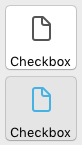
Botón barra de herramientas
El estilo del botón barra de herramientas está destinado principalmente a la integración en una barra de herramientas.
El estilo del botón Barra de herramientas tiene un fondo transparente con un título. Suele estar asociado a una imagen de 4 estados.
Ejemplo con estados seleccionado / no seleccionado / subrayado:

Ejemplo JSON:
	"myCheckBox": {
                "type": "checkbox",
                "style":"toolbar",
                "text": "Checkbox",
				"icon": "/RESOURCES/File.png",
				"iconFrames": 4
                "left": 60,
                "top": 160,
                "width": 100,
                "height": 20
                }
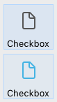
Bevel
El estilo del botón casilla de selección Bevel combina la apariencia del estilo de botón Clásico (es decir, un rectángulo con un título descriptivo) con el comportamiento del estilo del botón Barra de herramientas.
El estilo de botón Bevel redondeado tiene un fondo gris claro con un título. Suele estar asociado a una imagen de 4 estados.
Ejemplo con estados seleccionado / no seleccionado / subrayado:

Ejemplo JSON:
	"myCheckBox": {
                "type": "checkbox",
                "style":"bevel",
                "text": "Checkbox",
 				"icon": "/RESOURCES/File.png",
				"iconFrames": 4
              	"left": 60,
                "top": 160,
                "width": 100,
                "height": 20
                }
Bevel redondeado
El estilo del botón de la casilla de selección Bevel redondeado es casi idéntico al estilo del botón Bevel, excepto que, dependiendo del sistema operativo, las esquinas del botón pueden ser redondeadas. Al igual que el estilo de botón Bevel, el estilo del botón Bevel redondeado combina la apariencia del estilo del botón Clásico con el comportamiento del estilo del botón Barra de herramientas.
El botón Bevel tiene un fondo gris claro con un título. Suele estar asociado a una imagen de 4 estados.
Ejemplo en macOS:
En Windows, el estilo de botón Bevel redondeado es idéntico al estilo de botón Bevel.
Ejemplo JSON:
	"myCheckBox": {
                "type": "checkbox",
                "style":"roundedBevel",
                "text": "Checkbox",
 				"icon": "/RESOURCES/File.png",
				"iconFrames": 4
                "left": 60,
                "top": 160,
                "width": 100,
                "height": 20
                }
OS X Gradient
El estilo del botón casilla de selección OS X Gradient es casi idéntico al estilo del botón Bevel. Al igual que el estilo de botón Bevel, el estilo del botón OS X Gradient combina la apariencia del estilo del botón Clásico con el comportamiento del estilo del botón Barra de herramientas.
El estilo del botón Gradient OS X tiene un fondo gris claro con un título y se puede mostrar como un botón de sistema de dos tonos en macOS. Suele estar asociado a una imagen de 4 estados.

En Windows, este estilo de botón casilla de selección es idéntico al estilo de botón Bevel.
Ejemplo JSON:
	"myCheckBox": {
			"type": "checkbox",
			"style":"gradientBevel",
			"text": "Checkbox",
			"icon": "/RESOURCES/File.png",
			"iconFrames": 4
			"left": 60,
			"top": 160,
			"width": 100,
			"height": 20
           }
OS X Texturizado
El estilo de botón OS X Textured es similar al estilo del botón Bevel pero con un tamaño menor (el tamaño máximo es el de un botón de sistema estándar de macOS). Al igual que el estilo de botón Bevel, el estilo del botón OS X Textured combina la apariencia del estilo del botón Clásico con el comportamiento del estilo del botón Barra de herramientas.
Por defecto, el estilo del botón OS X Textured aparece como:
- Windows - un botón sistema estándar con un fondo azul claro con un título en el centro.

- macOS - un botón de sistema estándar. Su altura está predefinida: no es posible ampliarla o reducirla.

Ejemplo JSON:
	"myCheckBox": {
			"type": "checkbox",
			"style":"texturedBevel",
			"text": "Checkbox",
			"left": 60,
			"top": 160,
			"width": 100,
			"height": 20
			}
Office XP
El estilo de botón Office XP combina la apariencia del estilo del botón Clásico con el comportamiento del estilo del Botón barra de herramientas.
Los colores (resaltado y fondo) de una casilla de selección con el estilo de botón Office XP se basan en los colores del sistema. La apariencia de la casilla de selección puede ser diferente cuando el cursor pasa por encima, dependiendo del sistema operativo:
- Windows - su fondo sólo aparece cuando el ratón pasa por encima. Ejemplo con estados seleccionado / no seleccionado / subrayado:

- macOS - su fondo se muestra siempre. Ejemplo con estados seleccionado / no seleccionado:
Ejemplo JSON:
	"myCheckBox": {
                "type": "checkbox",
                "style":"office",
                "text": "Checkbox",
                "action": "fontBold",
 				"icon": "/RESOURCES/File.png",
				"iconFrames": 4
               "left": 60,
                "top": 160,
                "width": 100,
                "height": 20
                }
Contraer/Desplegar
Este estilo de botón de casilla de selección se puede utilizar para añadir un icono estándar de contraer/expandir. Estos iconos se utilizan de forma nativa en las listas jerárquicas.
- Windows - el icono se ve como un [+] o un [-]
- macOS - se ve como un triángulo que apunta hacia la derecha o hacia abajo.

El estilo Contraer/Desplegar se denomina "disclosure" en la gramática JSON del estilo de botón.
Ejemplo JSON:
	"myCheckBox": {
                "type": "checkbox",
                "style":"disclosure",
				"method": "m_collapse",
				"left": 60,
                "top": 160,
                "width": 100,
                "height": 20
                }
Divulgación
En macOS y Windows, una casilla de selección con el estilo de botón "Divulgación" aparece como un botón de información estándar, normalmente utilizado para mostrar/ocultar información adicional. Cuando se utiliza como botón radio, el símbolo del botón apunta hacia abajo con el valor 0 y hacia arriba con el valor 1.
-
Windows

-
macOS

El estilo Disclosure se denomina "roundedDisclosure" en la gramática JSON del estilo de botón.
Ejemplo JSON:
	"myCheckBox": {
                "type": "checkbox",
                "style":"roundedDisclosure",
				"method": "m_disclose",
                "left": 60,
                "top": 160,
                "width": 100,
                "height": 20
                }
Personalizado
El estilo del botón Personalizado acepta una imagen de fondo personalizada y permite gestionar propiedades específicas:
Generalmente está asociado con una imagen de 4 estados, que puede ser usada en conjunto con una imagen de fondo 4 estados.
Ejemplo JSON:
	"myCheckbox": {
		"type": "checkbox",
		"style":"custom",
		"text": "OK",
		"icon": "/RESOURCES/smiley.jpg",
		"iconFrame": 4,
		"customBackgroundPicture": "/RESOURCES/paper.jpg",
		"iconOffset": 5, //desplazamiento del icono personalizado al hacer clic
		"left": 60,
		"top": 160,
		"width": 100,
		"height": 20,
		"customBorderX": 20,
		"customBorderY": 5
		}
Propiedades soportadas
Todas las casillas de selección comparten un mismo conjunto de propiedades básicas:
Negrita - Abajo - Estilo de botón - Clase - Editable - Tipo de expresión - Enfocable - Fuente - Color de fuente - Tamaño de fuente - Alto - Mensaje de ayuda - Alineación horizontal(1) - Tamaño horizontal - Título de la imagen(2) - Itálica - Izquierda - Número de estados(2) - Nombre del objeto - Ruta de la imagen(2) - Derecha - Guardar valor - Acceso directo - Acción estándar - Título - Posición del título/imagen(2) - Arriba - Tipo - Subrayado - Variable o expresión - Tamaño vertical - Visibilidad - Ancho
(1) No soportado por los estilos Regular y Flat.
(2) No soportado por los estilos Regular, Flat, Disclosure y Collapse/Expand.
Propiedades específicas adicionales están disponibles en función del estilo de botón:
- Personalizado: Ruta de fondo - Margen horizontal - Desplazamiento del ícono - Margen vertical
- Plana, Regular: Tres Estados
Eventos soportados
On Begin Drag Over - On Clicked - On Double Clicked - On Drag Over - On Drop - On Losing focus - On Mouse Enter - On Mouse Leave - On Mouse Move - On Printing Break - On Printing Detail - On Printing Footer - On Unload - On Validate