Criar uma area 4D Write Pro
Arrastar e Soltar
Para configurar as propriedades arrastar e soltar para suas áreas 4D Write Pro, é necessário seleciar as opções apropriadas no tema "Action" na lista de Propriedades:
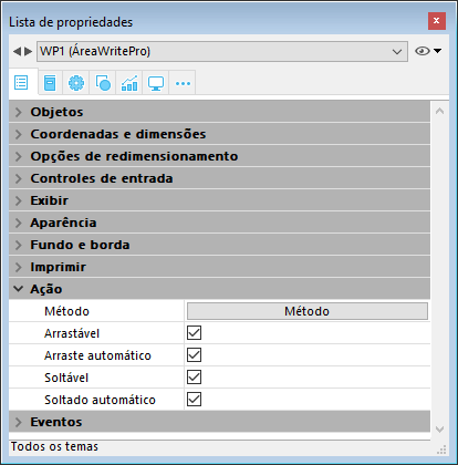
Áreas 4D Write Pro suporta dois modos arrastar e soltar:
- Modo personalisado: apenas as opções "Arrastável" e "Soltável" estão marcadas.
Neste modo, pode selecionar texto e começar a movê-lo. O método objeto é chamado com o evento On Begin Drag Over , e assim pode definir a ação soltar usando o modo personalisado. - Modo Automatico: as opções "Arrastável", "Soltável", "Arraste automático" e "Soltado automático" estão marcadas
Neste modo, pode automativamente mover ou copiar (aperte a tecla Alt/Option) o texto selecionado. O evento On Begin Drag Over não é ativado.
Nota: Selecionar apenas as opções "Arraste automático" e "Soltado automático" não terá efeito na área 4D Write Pro area.
Propriedades de Vista
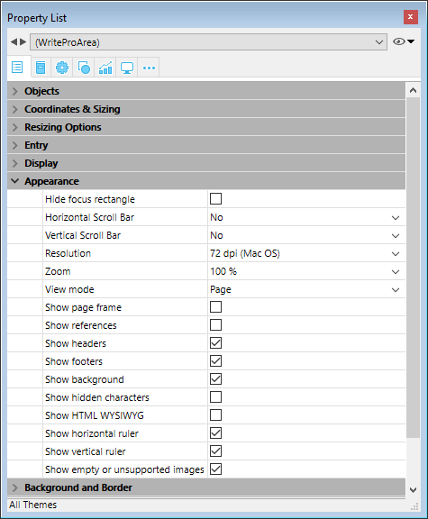
As propriedades de vista do documento estão diretamennte disponíveis na lista Propriedades das áreas 4D Write pro para permitier que defina como um documento 4D Write será exibido como padrão nesta área. Estas propriedades permitem que personalise, por exemplo, se os documentos 4D Write Pro são exibidos da mesma maneira que serão impressos, ou como gerados pelo navegador. Pode estabelecer diferentes vistas do mesmo documento 4D Write Pro no mesmo formulário.
Nota: Configurações de Vista podem ser gerenciadas dinamicamente usando os comandos WP SET VIEW PROPERTIES e WP Get view properties.
Configurações de vista de documento são gerenciadas através de itens específicos no tema Aparência da lista de propriedades de objetos de formulário 4D Write Pro.:
-
Resolução: Estabelece a resolução de tela para os conteúdos de área 4D Write Pro. Como padrão, é estabelecido em 72 dpi (Mac OS), que é a resolução padrão para formulários 4D em todas as plataformas. Estabelecer esta propriedade para Automático faz com que oa geração do documento seja diferente entre as plataformas Mac Os e Windows. Estabelecer um valor de dpi específico faz com que a geração do documento seja a mesma nas plataformas Mac OS e Windows.
-
Zoom: Estabelece a porcentagem do zoom para exibir os conteúdos da área 4D Write Pro. O normal é 100%.
-
Modo de Vista: Estabelece o modo para exibir o documento 4D Write Pro na área formulário. Três valores estão disponíveis:
- Página (padrão): o modo de vista mais completo que inclui limites de página, orientação, margens, quebra de página, cabeçalhos, rodapés, etc. Para saber mais veja o parágrafo Propriedades de visualização de página.
- Rascunho: modo rascunho com propriedades de documento básicas
- Embebido: modo de vista adequado para áreas embebidas. Não exibe margens, cabeçalhos, rodapés, bordas de página, etc.
Este modo também pode ser usado para produzir uma vista de página do tipo Web (se também selecionar a resolução de 96 dpi e a opção Show HTML WYSIWYG).
Nota: A propriedade Modo de vista é usada apenas para geração na tela. Em quanto a configurações de impressão, regras específicas de geração são usadas automaticamente (ver Imprimir documentos 4D Write Pro).
-
Mostrar page frame: Exibe ou esconde a borda da página quando o modo de vista for estabelecido como "Página". O normal é escondido.
-
Mostrar referências: Exibe todas as expressões 4D inseridas no documento como referências. Quando esta opção não estiver marcada (padrão) as expressões 4D são exibidas como valores. Quando inserir um campo ou expressão 4D, 4D Write Pro computa e exibe o valor atual. Se quiser saber que campos ou expressões estão sendo exibidas, marque esta opção. As referências do campo ou expressão vão aparecer em seu documento, com um fundo cinza.
Por exemplo, se inserir a data atual junto com o formato, a data é exibida:

Se marcar a opção Mostrar referências, a referência é exibida:

Nota: expressões 4D podem ser inseridas usando o comando ST INSERT EXPRESSION. -
Mostrar cabeçalhos e rodapés: Exibe ou esconde os cabeçalhos e rodapés quando o modo de página estiver estabelecido como "Página" (exibido como padrão). Para saber mais, veja .
-
**Mostrar fundo: Exibe/esconde tanto as imagens de fundo quando a cor de fundo (padrão é exibido)
-
**Mostrar caracteres escondidos: Exibe ou esconde caracteres invisíveis (padrão é escondido).
-
**Mostrar HTML WYSIWYG: Ativa ou desativa a vista HTML WYSIWYG, na qual qualquer atributo avançado 4D Write Pro que não forem compatíveis com todos os navegadores serão removidos (padrão é desaqtivado).
-
Mostrar régua horizontal: horizontal. Para saber mais sobre as réguas nas áreas 4D Write Pro, consulte Manejar réguas.
-
Mostrar régua vertical: mostra/oculta a régua vertical quando o documento estiver em modo Página. Para saber mais sobre as réguas nas áreas 4D Write Pro, consulte Manejar réguas.
-
Mostrar imágens vaziaws ou não compatíveis: mostra/oculta um retângulo negro para s imagens que não podem ser carregadas ou calculadas (imagens vazias ou em um formato não compatível). Para saber mais veja Imagens vazias.
-
Mostrar a fonte da fórmula como símbolo: mostra o texto fonte das formulas como
 símbolos quando as expressões são mostradas como referencias (ver acima). Mostrar as fórmulas como símbolos faz com que os documentos de modelo sejam mais compactos e mais wysiwyg.
Menu contextual
Se a propriedade Menu contextual está selecionada por uma área 4D Write Pro (ver Criar uma área 4D Write Pro), um menu contextual completo está disponível para os usuários em modo Aplicação:

Este menu oferece acesso a todas as funcionalidades de 4D Write Pro.
Selecionar o modo de visualização
Os documentos 4D Write Pro podem ser visualizados em três modos de vista de página:
- Rascunho: modo rascunho com propriedades básicas
- Página: modo "vista imprimir" (novo em 4D v15 R5)
- Embebido: modo adequado para áreas embebidas, não exibe margens, cabeçalhos, rodapés, bordas de página, etc
Este modo pode ser usado para produzir output do tipo Web (se selecionar também a resolução de 96 dpi e a opção HTML WYSIWYG).
O modo de visualização pode ser configurardo utilizando a área de menu pop-up:
Nota: o modo de visualização da página não são armazenadas com o documento.
Para áreas embebidas em formulários 4D, o modo vista pode ser também definido como padrão usando a lista Propriedades. Neste caso, o modo de vista é armazenado como uma propriedade do objeto de formulário 4D Write Pro (para saber mais, veja o parágrafo Configurar propriedades de Vista).
Ações padrão
A interface de usuário de áreas 4D Write Pro pode ser manejada através de um amplo conjunto de ações padrão. As ações padrão podem ser atribuidas a:
- comandos de menu, disponíveis através da barra de menu ou do comando Dynamic pop up menu
- list items, listas pop up ou drop down, menus pop up hierárquicos
- botões, check boxes
- ou executados pelo comando INVOKE ACTION.
Quando são atribuidos aos objetos de interface, as ações padrão manejam a ativação/desativação de objeto em função de contexto. Para mais informação, consulte a seção Ações padrões.
Dois tipos de ações estão disponíveis para áreas 4D Write Pro:
- As ações específicas 4D Write Pro, que só podem ser utilizadas com áreas 4D Write Pro,
- Outras ações, incluido as fontes, expressões, corretor ortográfico e ações de edição, que podem ser utilizadas com as áreas 4D Write Pro e as outras áreas 4D (ver Ações padrões).
Ações 4D Write Pro
Notas:
- As ações que mostram um menu/lista só podem ser associadas aos comandos de menu ou aos objetos pop-up/listas suspensas e menus pop-up hierárquicos (ver Submenu).
- Check boxes e 3D check boxes devem ser associadas com ações de estado, tais como "section/differentFirstPage" ou "visibleHorizontalRuler". Três opções de estado são suportadas com check boxes padrão apenas.
- um status de ação de seção é sempre igual ao status atual de seção selecionada (estado herdado se o atributo for herdado da seção pai ou de um atributo padrão) já que deve refletir o status de seção selecionada (o status que é aplicado atualmente para a seção). Entretanto, modificar o atributo de seção com uma ação padrão vai sobrepujar o atributo de seção selecionado.
- Submenu: Quando usado sem parâmetros e associados ao comando menu, um pop-up/lista drop down ou um objeto de menu hierárquico pop-up, essas ações exibem um submenu/lista automática. Por exemplo, se atribuir a ação "backgroundColor" a um comando de menu, selecionando este comando de menu na execução vai exibir os itens de submenu de Cor de Fundo. Se atribuir a ação "zoom" a um menu hierárquico pop-up menu, vai conter automaticamente conter uma lista de valores pré-definidos de zoom. Note que essas ações não podem ser atribuídas aos botões.
- showDialog:Adicionar a string "/showDialog" ao nome de ação permite a exibição da caixa de diálogo padrão associada para a ação. Por exemplo, pode ser usado "paragraph/styleSheet/showDialog" para abrir o diálogo de input que permite a entrada de um novo nome de folha de estilo. .
| Ação | Sintaxe | Disponível com | Descrição |
|---|---|---|---|
| anchorHorizontalAlign | {image | textBox}/anchorHorizontalAlign?value={left | center | right} | Image, Textbox, Submenu | Defines the horizontal alignment of the element, relative to the anchorOrigin for images/text boxes in page, or to the layout box for images/text box in embedded mode. This action will reset the horizontal offset to 0. (not enabled for inline images). |
| anchoring | {image | textBox}/anchoring | Submenu | Default submenu with anchor settings actions for images or text boxes |
| anchorLayout | image/anchorLayout?value={front | behind | wrapTopBottom | wrapSquareLeft | wrapSquareRight | wrapSquareLargest | wrapSquare | inline} textBox/anchorLayout?value={front | behind | wrapTopBottom | wrapSquareLeft | wrapSquareRight | wrapSquareLargest | wrapSquare} | Image, Textbox, Submenu | Defines the anchor layout type for an image or a text box. Can be used to transform an inline image to an anchored image, or the reverse. Note: If an image is moved from an anchored mode to inline, the image is inserted at the beginning of the current selected text. "inline" value is not supported for text boxes |
| anchorOrigin | {image | textBox}/anchorOrigin?value={paper-box | header-box | footer-box} | Image, TextBox, Submenu | Defines the area relative to the absolute position of an anchored image or text box. If the element is relative to the header-box/footer-box which is not visible on a page, the element is not displayed. This action will reset horizontal and vertical offsets to 0. Page mode only, not enabled for inline images. |
| anchorPage | {image | textBox}/anchorPage?value={all | current | currentSubSection} | Image, TextBox, Submenu | Defines the page(s) where the selected image or text box is displayed (not enabled for inline images). Page mode only. |
| anchorSection | {image | textBox}/anchorSection?value={all | current} | Image, TextBox, Submenu | Defines the section(s) where the selected image or text box is displayed. (not enabled for inline images). Page mode only. |
| anchorVerticalAlign | {image | textBox}/anchorVerticalAlign?value={top | center | bottom} | Image, TextBox Submenu | Defines the vertical alignment of the image or text box, relative to the anchorOrgin for an image or text box in page, or to the layout box for an image or text box in embedded mode. This action will reset the vertical offset to 0 (not enabled for inline images). Note: See "verticalAlign" action for the vertical alignment inside the text box |
| avoidPageBreakInside | {paragraph/}avoidPageBreakInside | Paragraph | |
| background | {doc | paragraph | image | textBox | section | header | footer | table | row | column | cell/}background | Document, Paragraph, Image, TextBox, Section, Header, Footer, Table, Row, Column, Cell, Submenu | For menu commands only. Default submenu for all background attributes. |
| backgroundClip | {doc | paragraph | image | textBox | section | header | footer | table | row | column | cell/}backgroundClip?value={paper-box | border-box | padding-box | content-box} | Document, Paragraph, Image, TextBox, Section, Header, Footer, Table, Row, Column, Cell, Submenu | Changes target background clipping box (default target is paragraph). Paper-box targets document and section only. |
| backgroundColor | {doc | paragraph | image | textBox | section | header | footer | table | row | column | cell/}backgroundColor?value={<Css_color> | transparent} | Document, Paragraph, Image, TextBox, Section, Header, Footer, Table, Row, Column, Cell, Submenu, showDialog | Changes target background. |
| backgroundDisplayMode | {doc | paragraph | image | textBox | section | header | footer | table | row | column | cell/}backgroundDisplayMode?value=scaledToFit | truncated | truncatedCentered | proportional | proportionalCentered | replicated | replicatedCentered | Document, Paragraph, Image, TextBox, Section, Header, Footer, Table, Row, Column, Cell, Submenu | Sets the display mode of images used as background. |
| backgroundImage | {doc | paragraph | image | textBox | section | header | footer | table | row | column | cell/}backgroundImage?value=none | Document, Paragraph, Image, TextBox, Section, Header, Footer, Table, Row, Column, Cell, Submenu, showDialog | Clears target background image. (default target is paragraph) |
| backgroundOrigin | {doc | paragraph | image | textBox | section | header | footer | table | row | column | cell/}backgroundOrigin?value={paper-box | border-box | padding-box | content-box} | Document, Paragraph, Image, TextBox, Section, Header, Footer, Table, Row, Column, Cell, Submenu | Changes target background image origin box (default target is paragraph). Paper-box targets document and section only. |
| backgroundPositionH | {doc | paragraph | image | textBox | section | header | footer | table | row | column | cell/}backgroundPositionH?value={left | right | center} | Document, Paragraph, Image, TextBox, Section, Header, Footer, Table, Row, Column, Cell, Submenu | Changes target background image horizontal alignment (default target is paragraph). Ex: paragraph/backgroundPositionH?value=left |
| backgroundPositionV | {doc | paragraph | image | textBox | section | header | footer | table | row | column | cell/}backgroundPositionV?value={top | bottom | center} | Document, Paragraph, Image, TextBox, Section, Header, Footer, Table, Row, Column, Cell, Submenu | Changes target background image vertical alignment (default target is paragraph). Ex: paragraph/backgroundPositionV?value=top |
| backgroundRepeat | {doc | paragraph | image | textBox | section | header | footer | table | row | column | cell/}backgroundRepeat?value={no-repeat | repeat | repeat-x | repeat-y} | Document, Paragraph, Image, TextBox, Section, Header, Footer, Table, Row, Column, Cell, Submenu | Changes target background image repeat mode. (default target is paragraph) |
| backgroundSizeH | {doc | paragraph | image | textBox | section | header | footer | table | row | column | cell/}backgroundSizeH?value={<Css_length> | <Css_percentage> | auto | cover | contain} | Document, Paragraph, Image, TextBox, Section, Header, Footer, Table, Row, Column, Cell, Submenu | Changes target background image width (default target is paragraph). Ex: paragraph/backgroundSizeH?value=100%. section/backgroundSizeH?value=cover |
| backgroundSizeV | {doc | paragraph | image | textBox | section | header | footer | table | row | column | cell}/backgroundSizeV?value={<Css_length> | <Css_percentage> | auto} | Document, Paragraph, Image, TextBox, Section, Header, Footer, Table, Row, Column, Cell, Submenu | Changes target background image height (default target is paragraph). Ex: paragraph/backgroundSizeV?value=50%. Ex: section/backgroundSizeV?value=40pt |
| bookmark | bookmark?index= | Submenu | Selects the Nth bookmark. Ex: bookmark?index=2 // selects the second bookmark |
| borderCollapse | borderCollapse | Paragraph | Collapses selected paragraph borders and interior margins. |
| borderColor | {doc | paragraph | image | textBox | section | header | footer | table | row | column | cell/}{inside | outside/}{borderColor | borderColorLeft | borderColorRight | borderColorTop | borderColorBottom | borderColorLeftRight | borderColorTopBottom}?value=<Css_color> | Document, Paragraph, Image, TextBox, Section, Header, Footer, Table, Row, Column, Cell, Submenu, showDialog | Changes target border color (default target is paragraph). Ex: paragraph/borderColorLeft?value=green |
| borderRadius | {doc | paragraph | image | textBox | section | header | footer/}borderRadius?value=<Css_length> | Document, Paragraph, Image, TextBox, Section, Header, Footer, Submenu | Changes target border radius (default target is paragraph). Ex: paragraph/borderRadius?value=4pt |
| borders | {doc | paragraph | image | textBox | section | header | footer | table | row | column | cell/}{inside | outside/}borders | Document, Paragraph, Image, TextBox, Section, Header, Footer, Table, Row, Column, Cell, Submenu | Default submenu for target borders. |
| borderStyle | {doc | paragraph | image | textBox | section | header | footer | table | row | column | cell/}{inside | outside/}{borderStyle | borderStyleLeft | borderStyleRight | borderStyleTop | borderStyleBottom | borderStyleLeftRight | borderStyleTopBottom}?value={none | hidden | dotted | dashed | solid | double | groove | ridge | inset | outset} | Document, Paragraph, Image, TextBox, Section, Header, Footer, Table, Row, Column, Cell, Submenu | Changes target border style (default target is paragraph). Ex: paragraph/borderStyleLeft?value=double. Ex: outside/borderStyle?value=solid //set selected paragraphs exterior borders to style solid. Ex: inside/borderStyle?value=none //remove selected paragraphs interior borders |
| borderWidth | {doc | paragraph | image | textBox | section | header | footer | table | row | column | cell/}{inside | outside/}{borderWidth | borderWidthLeft | borderWidthRight | borderWidthTop | borderWidthBottom | borderWidthLeftRight | borderWidthTopBottom}?value=<Css_length> | Document, Paragraph, Image, TextBox, Section, Header, Footer, Table, Row, Column, Cell, Submenu | Changes target border width (default target is paragraph). Ex: paragraph/borderWidthLeft?value=4pt |
| columnCount | {section/}columnCount?value={1<=number<=20} | Document, Section, Submenu | Number of columns in the current document and/or section. (default target is doc) Ex: section/columnCount?value=3 |
| columnRuleColor | {section/}columnRuleColor?value={CSS color} | Document, Section, Submenu, showDialog | Color for the decorative line between document or section columns. Ex: columnRuleColor?value="#FFFFFF" |
| columnRuleStyle | {section/}columnRuleStyle?value={none | dotted | dashed | solid | double | groove | ridge | inset | outset} | Document, Section, Submenu | Style for the decorative line between document or section columns. Ex: columnRuleStyle?value="solid" |
| columnRuleWidth | {section/}columnRuleWidth?value={CSS length} | Document, Section, Submenu | Width of the decorative line between document or section columns. Ex: columnRuleWidth?value="2pt" |
| columns | {section/}columns | Document, Section, Submenu | Only for a menu item: creates automatically a complete Columns sub-menu with all column actions sub-menus (except insertColumnBreak) |
| columnSpacing | {section/}columnSpacing?value={CSS length} | Document, Section, Submenu | Space between two columns in the current document and/or section. Ex: columnSpacing?value="1cm" |
| deleteColumns | deleteColumns | Table | Deletes all selected columns. |
| deleteRows | deleteRows | Table | Deletes all selected rows. |
| deleteStyleSheet | {paragraph | image/}deleteStyleSheet?index={1<= number <= number of target style sheets} | Paragraph, Image, Submenu | Removes the Nth stylesheet from the stored stylesheets for the selected target (default target is paragraph). Menu item name is replaced at runtime with style sheet name. |
| direction | direction?value={ltr | rtl} | Paragraph, Submenu | Paragraph direction. |
| displayFormulaAsSymbol | displayFormulaAsSymbol | Document | Displays formula references as a # symbol. Can only be used when formulas are displayed as references. |
| doc | doc | Document, Submenu | Default submenu for document body layout (embedded mode attributes or default attributes for sections – but for margin which is reserved for embedded mode only). |
| dpi | Modifies the dpi of the current view (independent of the document attribute wk dpi used internally for pixel conversion <-> points). | Submenu | Change view dpi. Ex: dpi?value=72 |
| emptyDatasource | {table}/emptyDatasource?value={showDataRow | hideDataRow | showPlaceholderRow | hideTable } | Table, Submenu | Defines how the table is displayed when its datasource is empty. |
| fontStyleWrite | fontStyleWrite | Submenu | For menu commands only. Displays default font styles submenu for 4D Write Pro. |
| fontSubscript | fontSubscript | Toggles subscript font attribute. | |
| fontSuperscript | fontSuperscript | Toggles superscript font attribute. | |
| footer | footer | Submenu | Displays the Footer submenu. |
| footer/remove | footer/remove | Footer | Removes the selected footer. |
| formulaHighlight | formulaHighlight?value={values | references | always | never} | Document, Submenu | Formula highlight mode for the document. Can be used with a dropdown menu or a button |
| formulaHighlightColor | formulaHighlightColor?value=<Css_color> | Document, Submenu,showDialog | Formula highlight color for the document |
| formulaHighlightReferences | formulaHighlightReferences | Document | Toggles formula references highlighting. Can be used with a check box or a menu item |
| formulaHighlightValues | formulaHighlightValues | Document | Toggles formula values highlighting. Can be used with a check box or a menu item |
| header | header | Submenu | Displays the Header submenu. |
| header/remove | header/remove | Header | Removes the selected header. |
| height | {image | textBox | row}/height?value={<Css_length> | auto} | Image, TextBox Row, Submenu | Target height. Ex: image/height?value=50pt. For image/width, see width. Ex: row/height?value=12pt |
| headerRowCount | {table/}headerRowCount | Table, Submenu | Sets the number of header rows in a table. Maximum is 5. |
| htmlWYSIWIGEnabled | htmlWYSIWIGEnabled | Document | Toggles between html wysiwyg mode. |
| image | image | Image, Submenu | Displays image layout submenu. |
| image/displayMode | image/displayMode?value=scaledToFit | truncated | truncatedCentered | proportional | proportionalCentered | replicated | replicatedCentered | Image, Submenu | Sets the display mode of anchored and inline images. Ex: image/displayMode?value=scaledToFit |
| image/verticalAlign | image/verticalAlign?value={top | middle | bottom | baseline | super | sub} | Image, Submenu | Image vertical alignment. Ex: image/verticalAlign?value=super |
| insertColumnBreak | insertColumnBreak | Paragraph | Inserts a column break at the selection. |
| insertColumnToTheLeft | insertColumnToTheLeft | Table | Inserts a column to the left of the first selected column(s). |
| insertColumnToTheRight | insertColumnToTheRight | Table | Inserts a column to the right of the last selected column(s). |
| insertContinuousSectionBreak | insertContinuousSectionBreak | Paragraph | Inserts a continuous section break at the selection. |
| insertImage | insertImage | Opens a picture selection dialog box and inserts the selected picture (if any) as a character in the area. | |
| insertPageBreak | insertPageBreak | Paragraph | Inserts a page break at the selection. |
| insertRowAbove | insertRowAbove | Table | Inserts a row above the selected row(s). |
| insertRowBelow | insertRowBelow | Table | Inserts a row below the selected row(s). |
| insertSectionBreak | insertSectionBreak | Paragraph | Inserts a section break at the selection. |
| insertSoftHyphen | insertSoftHyphen | Inserts a soft hyphen at the cursor position. | |
| insertTextBox | insertTextBox | Document | Inserts a text box near the current selection, anchored to the first selected page (page mode). |
| keepWithNext | keepWithNext | Paragraph | Links a paragraph with the next so that they cannot be separated by automatic page or column breaks. If applied to the last paragraph of the last cell in a table, the last row of the table is linked to the following paragraph. |
| lineHeight | lineHeight?value={<Css_length> | <Css_percentage>} | Paragraph, Submenu | Paragraph line height. Ex: lineHeight?value=120% |
| layer | {image | textBox}/layer | Submenu | Default submenu with layering actions for images or text boxes |
| listStartNumber | listStartNumber?value={ | Paragraph, Submenu | List start number. Ex: listStartNumber?value=10 |
| listStyleImage | listStyleImage/showDialog | Paragraph, showDialog | Opens a file dialog to choose a image to display as list style bullet; it will set also list style type to disc – style to be used if image is not found. |
| listStyleType | listStyleType?value={none | disc | circle | square | hollow-square | diamond | club | decimal | decimal-leading- zero | lower-latin | lower-roman | upper-latin | upper-roman | lower-greek | decimal-greek | armenian | georgian | hebrew | hiragana | katakana | cjk-ideographic} | Paragraph, Submenu | Paragraph list style type. |
| margin | {doc | paragraph | image | textBox | section | header | footer | table/}{inside | outside/}{margin | marginLeft | marginRight | marginTop | marginBottom | marginLeftRight | marginTopBottom}?value={<Css_length> | auto} | Document, Paragraph, Image, Textbox, Section, Header, Footer, Table, Submenu | Changes target margin (default target is paragraph). Ex: margin?value=4pt //sets all paragraph margins to 4pt. Ex: outside/margin?value=4pt //set exterior paragraph margins to 4pt. Ex: doc/marginLeft?value=1cm //sets left margin to 1cm for the document as used in embedded mode. Ex: section/marginLeft?value=1cm //sets left margin to 1cm for the pages of the first selected section |
| merge | {paragraph/}merge cell/merge | Paragraph, Cell | Used with paragraphs: merges paragraphs. Used with cells: merges the selected cells. |
| minHeight | {paragraph | image/}minHeight?value=<Css_length> | Paragraph, Image, Submenu | Target min height (default target is paragraph). Ex: paragraph/minHeight?value=50pt |
| minWidth | {paragraph | image/}minWidth?value=<Css_length> | Paragraph, Image, Submenu | Target min width (default target is paragraph). Ex: paragraph/minWidth?value=50pt |
| moveToBack | moveToBack | Image | Moves image to the back. (not enabled for inline images) |
| moveToFront | moveToFront | Image | Moves image to the front. (not enabled for inline images) |
| newLineStyleSheet | newLineStyleSheet?index={1<=number<=number of paragraph stylesheets | newLineStyleSheet}?value=auto | Paragraph, Submenu | Selected paragraph elements will use Nth stylesheet as stylesheet to use for new paragraphs created on Return or while splitting paragraphs; If value=auto, new paragraphs will use the same stylesheet (default). (menu item name is replaced at runtime with stylesheet name) |
| padding | {doc | paragraph | image | textBox | section | header | footer | column | row| cell/}{inside | outside/}{padding | paddingLeft | paddingRight | paddingTop | paddingBottom | paddingLeftRight | paddingTopBottom }?value=<Css_length> | Document, Paragraph, Image, TextBox, Section, Header, Footer, Row, Column, Cell, Submenu | Changes target padding. (default target is paragraph) |
| pageMode | pageMode?value={embedded | page | draft} | Submenu | Changes view mode. Ex: pageMode?value=page |
| pageOrientation | {section/}pageOrientation?value={landscape | portrait} | Section, Submenu | Changes document or first selected section page orientation (if section is not specified, it will apply to all sections otherwise to the first selected section). Ex: pageOrientation?value=portrait //change orientation to portrait for the whole document. Ex: section/pageOrientation?value=landscape //change orientation to landscape for the first selected section |
| pageSize | pageSize?index= | Submenu | Changes document page size: number is Nth page size in the list of available pages sizes. The list contains the current printer page sizes, ISO page sizes and the custom page sizes defined by the user. |
| paragraph | paragraph | Paragraph, Submenu | Default submenu for paragraph layout. |
| paragraph/avoidPageBreakInside | {paragraph/}avoidPageBreakInside | Paragraph | Allows/disallows page breaks inside paragraphs. |
| Document | Prints document as rendered in page mode with view settings of the focused 4D Write Pro area. | ||
| refreshImages | refreshImages | Image | Reloads images from the network for images with URLs. |
| removeSoftHyphens | removeSoftHyphens | Removes all soft hyphens in the current selection (if the selection is empty, removes soft hyphen before or after the caret if any) | |
| row/avoidPageBreakInside | row/avoidPageBreakInside | Table, Row | Allows/disallows page breaks inside table rows. This action is disabled if: the current selection does not contain a table the table does not allow page breaks the table is inside a header or footer Note: If several tables are selected and some of them don't allow page breaks, this option will be enabled but only applied to the tables that allow page breaks. |
| section | section | Section, Submenu | Default submenu for page layout for the first selected section. |
| section/differentFirstPage | section/differentFirstPage | Section | Section has different first page or not. |
| section/differentLeftRightPages | section/differentLeftRightPages | Section | Section has different left and right pages or not. |
| section/name/showDialog | section/name/showDialog | Section, showDialog | Displays a dialog allowing to enter the first selected section name. |
| section/remove | section/remove | Section | Deletes the first section that intersects the user’s selection regardless if the user has selected one or multiple sections. Disabled when only one section remains in the document. |
| section/reset | section/reset | Section | Resets all first selected section attributes to default attributes - which are inherited from doc attributes for background, border and padding (same as for embedded mode) and 2.5cm for page margins. First selected section column properties are also removed (so only default section properties will apply). |
| split | {paragraph/}split cell/split | Paragraph, Cell | Used with paragraph: splits paragraph. Used with cells: splits the selected cells (only cells that have been already merged may be split). |
| styleSheet | {paragraph | image/}styleSheet?value={1<=number<=number of target style sheets} | Paragraph, Image, Submenu, showDialog | Applies Nth stylesheet to the selected target elements. With dialog, new stylesheet will use current attributes from the first selected target. (default target is paragraph) Ex: styleSheet?value=1 //apply first paragraph style sheet to the selected paragraphs and set it as paragraph stylesheets. |
| styleSheets | {paragraph | image/}styleSheets | Paragraph, Image, Submenu | Default submenu for editing target stylesheets. |
| tabDecimalSeparator | tabDecimalSeparator?value={point | comma | pointOrComma | system} | Document, Submenu | Defines the character used as decimal separator by decimal tabulations. |
| tableAlign | tableAlign?value={left | center | right} or table/tableAlign?value={left | center | right} | Table, Submenu | Specifies horizontal alignment for a table. |
| table/avoidPageBreakInside | table/avoidPageBreakInside | Table | Allows/disallows page breaks inside tables. Disabled if: the current selection does not contain at least one table the table is in a header or a footer |
| table/bottomCarryOverRow | table/bottomCarryOverRow | Table | Toggles between display/not display of carry-over rows (see Carry-over rows). |
| textAlign | textAlign?value={left | right | center | justify | initial} | Paragraph | Paragraph text alignment (initial=use right for rtl or left for ltr direction). |
| textBox | textBox | Submenu | Submenu with all actions available for the focused/selected text box |
| textBox/remove | textBox/remove | TextBox | Removes the selected text box |
| textIndent | textIndent?value=<Css_length> (may be negative) | Paragraph, Submenu | Paragraph text indentation (first line indentation). Ex: textIndent?value=2cm |
| textLinethrough | textLinethrough | Submenu | For menu commands only. Linethrough submenu (with style and color). |
| textLinethroughColor | textLinethroughColor?value={<Css_color> | currentColor} | Submenu, showDialog | Ex: textLinethroughColor?value=red |
| textLinethroughStyle | textLinethroughStyle?value={none | solid | dotted | dashed | double | semi-transparent | word} | Submenu | Ex: textLinethroughStyle?value=dotted |
| textShadow | textShadow | Submenu | For menu commands only. Default submenu for text shadow (with color and offset). |
| textShadowColor | textShadowColor?value={<Css_color> | none} | Submenu, showDialog | Changes shadow status or color for characters. Ex: textShadowColor?value=green |
| textShadowOffset | textShadowOffset?value=<Css_length> | Submenu | Only length in pt is supported. Ex: textShadowOffset?value=2pt |
| textTransform | textTransform?value={none | capitalize | uppercase | lowercase | small-uppercase} | Submenu | Formats text. Ex: textTransform?value=capitalize |
| textUnderline | textUnderline | Submenu | For menu commands only. Underline submenu (with style and color) |
| textUnderlineColor | textUnderlineColor?value={<Css_color> | currentColor} | Submenu, showDialog | Ex: textUnderlineColor?value=red |
| textUnderlineStyle | textUnderlineStyle?value={none | solid | dotted | dashed | double | semi-transparent | word} | Submenu | Ex: textUnderlineStyle?value=dotted |
| updateStyleSheet | {paragraph | image/}updateStyleSheet | Paragraph, Image, Submenu | Updates first selected target stylesheet with first selected target current attributes (default target is paragraph) |
| userUnit | userUnit?value={cm | mm | in | pt} | Submenu | Changes document layout unit (will be reflected on rulers). |
| verticalAlign | {paragraph | row | column | cell | textBox/}verticalAlign?value={top | middle | bottom} | Paragraph, Row, Column, Cell, TextBox, Submenu | Paragraph vertical alignment. Ex: verticalAlign?value=top. The effect depends on the minHeight value of the paragraph. |
| view | view | Submenu | For menu commands only. Default submenu for view settings. |
| visibleBackground | visibleBackground | Document | Shows/hides background, anchored pictures and text boxes |
| visibleEmptyImages | visibleEmptyImages | Document | Shows/hides a default black rectangle for images that cannot be loaded or computed (empty images or images in an unsupported format). |
| visibleFooters | visibleFooters | Document | Shows/hides footers. |
| visibleHeaders | visibleHeaders | Document | Shows/hides headers. |
| visibleHiddenChars | visibleHiddenChars | Document | Shows/hides hidden characters |
| visibleHorizontalRuler | visibleHorizontalRuler | Document | Shows/hides horizontal ruler. |
| visiblePageFrames | visiblePageFrames | Document | Shows/hides page frames. |
| visibleVerticalRuler | visibleVerticalRuler | Document | Shows/hides vertical ruler (Page mode only). |
| visibleTableBorders | visibleTableBorders | Document | Shows/hides internal and external table borders as dashed lines where no borders are defined. |
| widowAndOrphanControlEnabled | widowAndOrphanControlEnabled | Paragraph | Toggles between widow and orphan control mode. |
| width | {paragraph | image | textBox | column/}width?value=<Css_length> | auto | Paragraph, Image, TextBox, Column, Submenu | Target width (default target is paragraph). Auto value not available for text boxes (converted to 8 cm) and columns. Ex: image/width?value=50pt |
| zoom | zoom?value={25% <= percentage in Css <= 400%} | Document, Submenu | Changes document view zoom. Ex: zoom?value=120% |
Outras ações
Outras ações padrão estão disponíveis nos formulários 4D e podem ser utilizadas nas áreas 4D Write Pro:
- Ações Edição, tais como ações de copiar/colar.
- Ações Fonte, tais como FontBold ou fontSize.
- Ações Expressões dinâmicas, permitendo manejar a inserção de expressões.
- Ações Correção ortográfica.