List Box
Columns
Collection of columns of the list box.
JSON Grammar
| Name | Data Type | Possible Values |
|---|---|---|
| columns | collection of column objects | Contains the properties for the list box columns |
For a list of properties supported by column objects, please refer to the Column Specific Properties section.
Objects Supported
Detail Form Name
Selection type list box
Specifies the form to use for modifying or displaying individual records of the list box.
The specified form is displayed:
- when using
Add SubrecordandEdit Subrecordstandard actions applied to the list box (see Using standard actions), - when a row is double-clicked and the Double-click on Row property is set to "Edit Record" or "Display Record".
JSON Grammar
| Name | Data Type | Possible Values |
|---|---|---|
| detailForm | string |
|
Objects Supported
Double-click on row
Selection type list box
Sets the action to be performed when a user double-clicks on a row in the list box. The available options are:
- Do nothing (default): Double-clicking a row does not trigger any automatic action.
- Edit Record: Double-clicking a row displays the corresponding record in the detail form defined for the list box. The record is opened in read-write mode so it can be modified.
- Display Record: Identical to the previous action, except that the record is opened in read-only mode so it cannot be modified.
Double-clicking an empty row is ignored in list boxes.
Regardless of the action selected/chosen, the On Double clicked form event is generated.
For the last two actions, the On Open Detail form event is also generated. The On Close Detail is then generated when a record displayed in the detail form associated with the list box is about to be closed (regardless of whether or not the record was modified).
JSON Grammar
| Name | Data Type | Possible Values |
|---|---|---|
| doubleClickInRowAction | string | "editSubrecord", "displaySubrecord" |
Objects Supported
Highlight Set
Selection type list box
This property is used to specify the set to be used to manage highlighted records in the list box (when the Arrays data source is selected, a Boolean array with the same name as the list box is used).
4D creates a default set named ListBoxSetN where N starts at 0 and is incremented according to the number of list boxes in the form. If necessary, you can modify the default set. It can be a local, process or interprocess set (we recommend using a local set, for example $LBSet, in order to limit network traffic). It is then maintained automatically by 4D. If the user selects one or more rows in the list box, the set is updated immediately. If you want to select one or more rows by programming, you can apply the commands of the “Sets” theme to this set.
- The highlighted status of the list box rows and the highlighted status of the table records are completely independent.
- If the “Highlight Set” property does not contain a name, it will not be possible to make selections in the list box.
JSON Grammar
| Name | Data Type | Possible Values |
|---|---|---|
| highlightSet | string | Name of the set |
Objects Supported
Locked columns and static columns
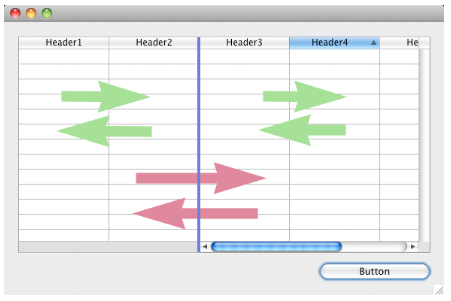
Locked columns and static columns are two separate and independent functionalities in list boxes:
- Locked columns always stay displayed to the left of the list box; they do not scroll horizontally.
- Static columns cannot be moved by drag and drop within the list box.
You can set static and locked columns by programming, refer to List Box in the 4D Language Reference manual.
These properties interact as follows:
-
If you set columns that are only static, they cannot be moved.
-
If you set columns that are locked but not static, you can still change their position freely within the locked area. However, a locked column cannot be moved outside of this locked area.

- If you set all of the columns in the locked area as static, you cannot move these columns within the locked area.

- You can set a combination of locked and static columns according to your needs. For example, if you set three locked columns and one static column, the user can swap the two right-most columns within the locked area (since only the first column is static).
Number of Locked Columns
Number of columns that must stay permanently displayed in the left part of the list box, even when the user scrolls through the columns horizontally.
JSON Grammar
| Name | Data Type | Possible Values |
|---|---|---|
| lockedColumnCount | integer | minimum: 0 |
Objects Supported
Number of Static Columns
Number of columns that cannot be moved during execution.
JSON Grammar
| Name | Data Type | Possible Values |
|---|---|---|
| staticColumnCount | integer | minimum: 0 |
Objects Supported
Number of Columns
Sets the number of columns of the list box.
You can add or remove columns dynamically by programming, using commands such as LISTBOX INSERT COLUMN or LISTBOX DELETE COLUMN.
JSON Grammar
| Name | Data Type | Possible Values |
|---|---|---|
| columnCount | integer | minimum: 1 |
Objects Supported
Row Control Array
Array type list box
A 4D array controlling the display of list box rows.
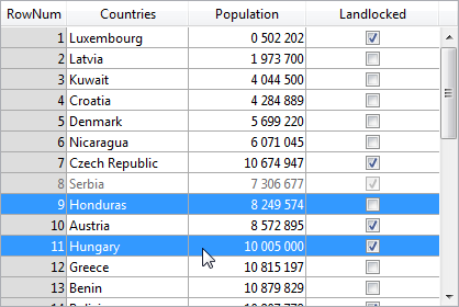
You can set the "hidden", "disabled" and "selectable" interface properties for each row in an array-based list box using this array. It can also be designated using the LISTBOX SET ARRAY command.
The row control array must be of the Longint type and include the same number of rows as the list box. Each element of the Row Control Array defines the interface status of its corresponding row in the list box. Three interface properties are available using constants in the "List Box" constant theme:
| Constant | Value | Comment |
|---|---|---|
| lk row is disabled | 2 | The corresponding row is disabled. The text and controls such as check boxes are dimmed or grayed out. Enterable text input areas are no longer enterable. Default value: Enabled |
| lk row is hidden | 1 | The corresponding row is hidden. Hiding rows only affects the display of the list box. The hidden rows are still present in the arrays and can be managed by programming. The language commands, more particularly LISTBOX Get number of rows or LISTBOX GET CELL POSITION, do not take the displayed/hidden status of rows into account. For example, in a list box with 10 rows where the first 9 rows are hidden, LISTBOX Get number of rows returns 10. From the user’s point of view, the presence of hidden rows in a list box is not visibly discernible. Only visible rows can be selected (for example using the Select All command). Default value: Visible |
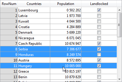
| lk row is not selectable | 4 | The corresponding row is not selectable (highlighting is not possible). Enterable text input areas are no longer enterable unless the Single-Click Edit option is enabled. Controls such as check boxes and lists are still functional however. This setting is ignored if the list box selection mode is "None". Default value: Selectable |
To change the status for a row, you just need to set the appropriate constant(s) to the corresponding array element. For example, if you do not want row #10 to be selectable, you can write:
aLControlArr{10}:=lk row is not selectable

You can define several interface properties at once:
aLControlArr{8}:=lk row is not selectable + lk row is disabled

Note that setting properties for an element overrides any other values for this element (if not reset). For example:
 aLControlArr{6}:=lk row is disabled + lk row is not selectable
 //sets row 6 as disabled AND not selectable
 aLControlArr{6}:=lk row is disabled
 //sets row 6 as disabled but selectable again
JSON Grammar
| Name | Data Type | Possible Values |
|---|---|---|
| rowControlSource | string | Row control array name |
Objects Supported
Selection Mode
Designates the option for allowing users to select rows:
- None: Rows cannot be selected if this mode is chosen. Clicking on the list will have no effect unless the Single-Click Edit option is enabled. The navigation keys only cause the list to scroll; the
On Selection Changeform event is not generated. - Single: One row at a time can be selected in this mode. Clicking on a row will select it. A Ctrl+click (Windows) or Command+click (macOS) on a row toggles its state (between selected or not).
The Up and Down arrow keys select the previous/next row in the list. The other navigation keys scroll the list. TheOn Selection Changeform event is generated every time the current row is changed. - Multiple: Several rows can be selected simultaneously in this mode.
JSON Grammar
| Name | Data Type | Possible Values |
|---|---|---|
| selectionMode | string | "multiple", "single", "none" |