iOS Storyboard
Now it's time to create your iOS detail form interface with Xcode.
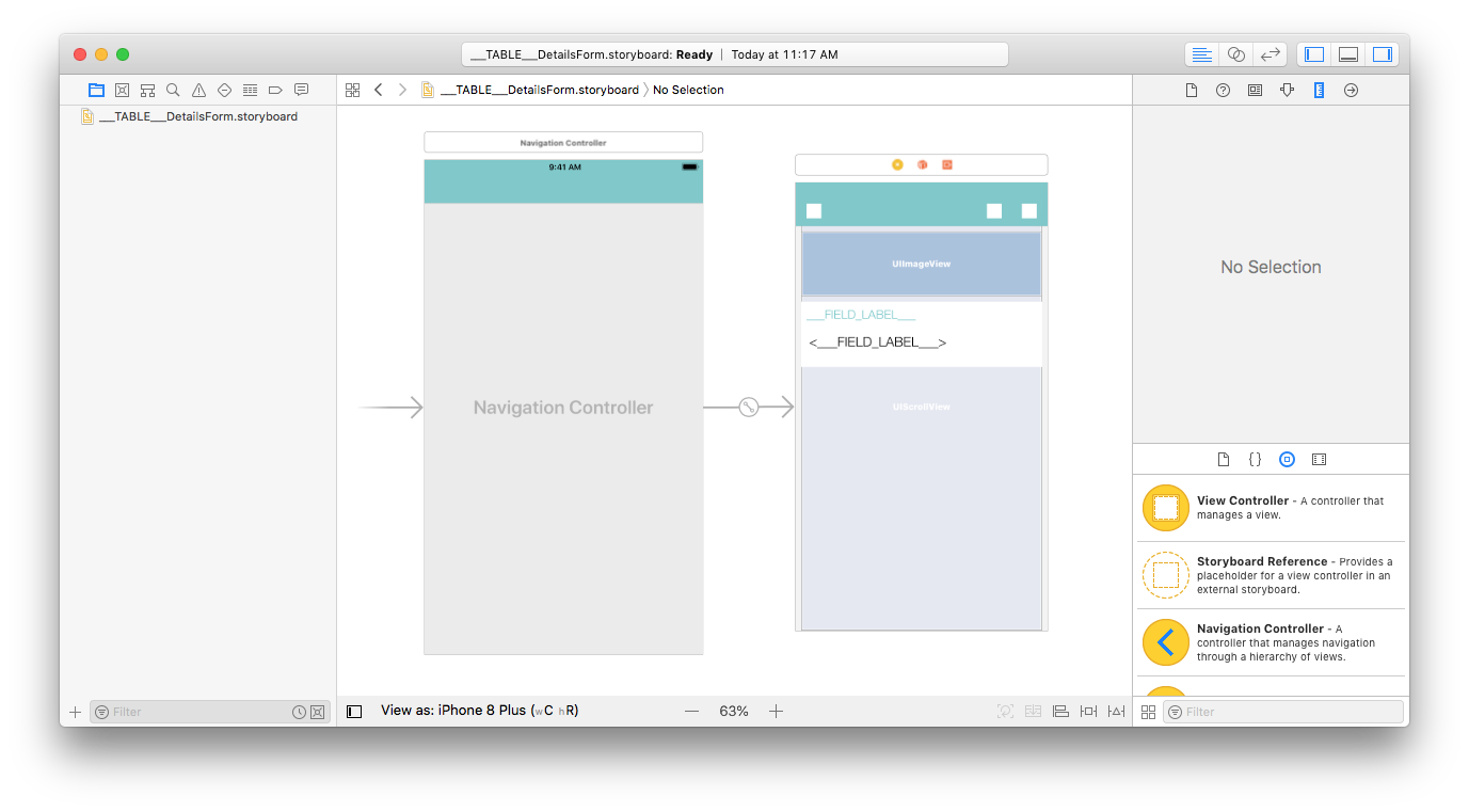
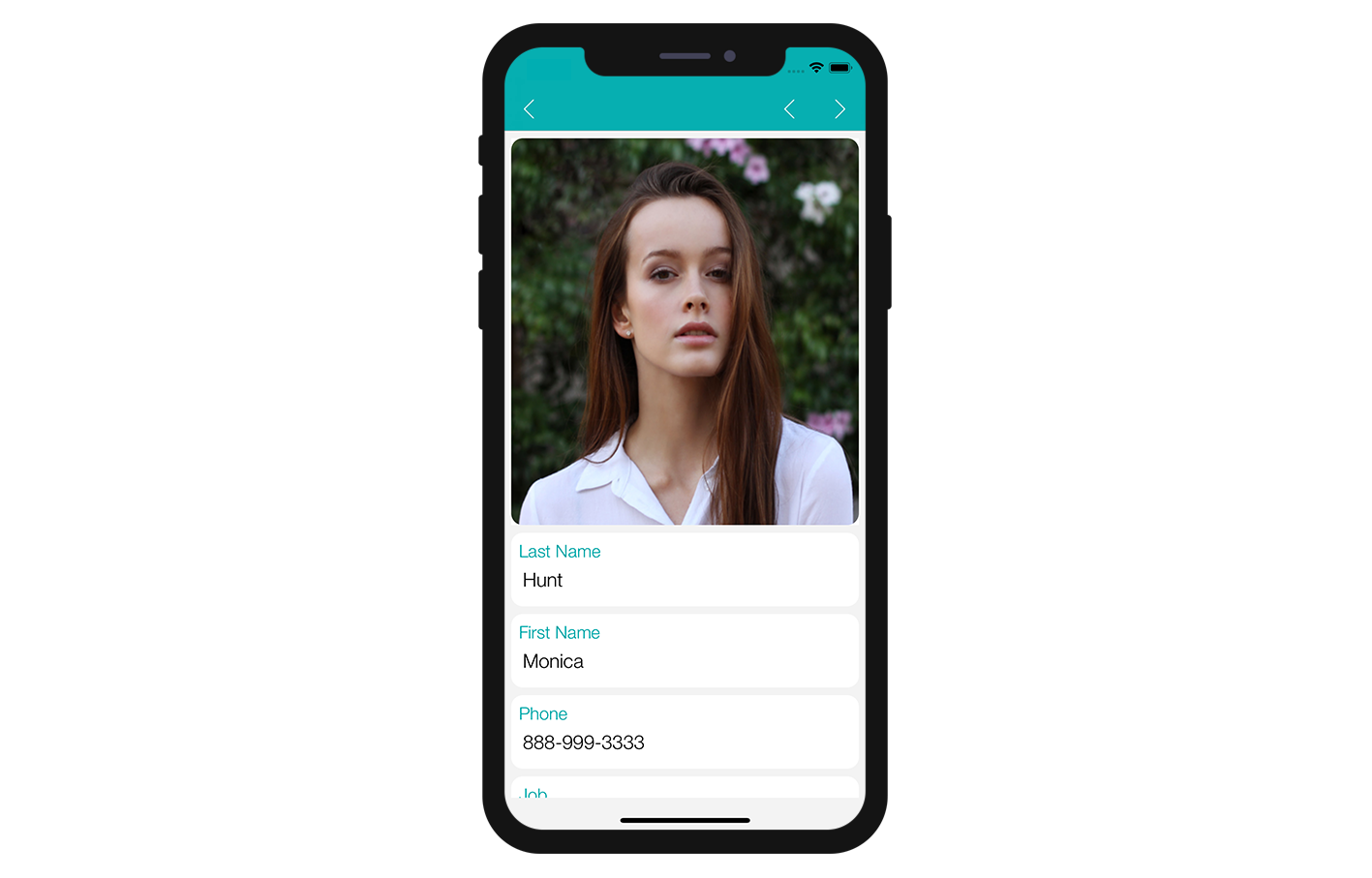
Here's the result we want to achieve:
For this template, we're going to add a:
- Profile header image
- A field to be duplicated
Open the storyboard file with Xcode
First, open your storyboard file in Xcode.
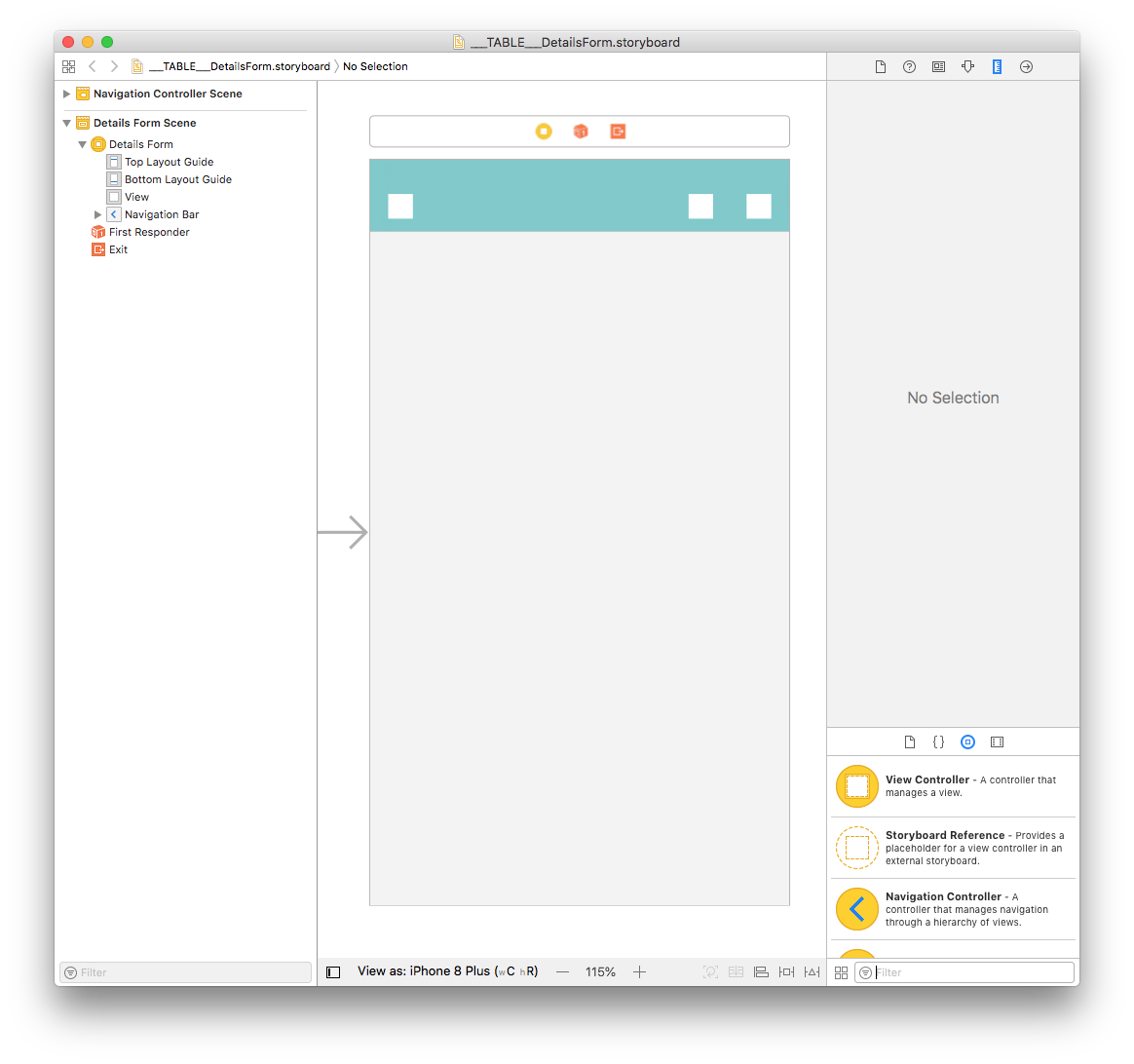
It's quite empty, so let's add some content!
Add a Scroll View
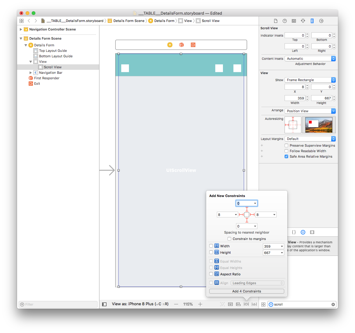
For our detail form to be scrollable, the first step is to drag and drop a "Scroll View" from the Object library.
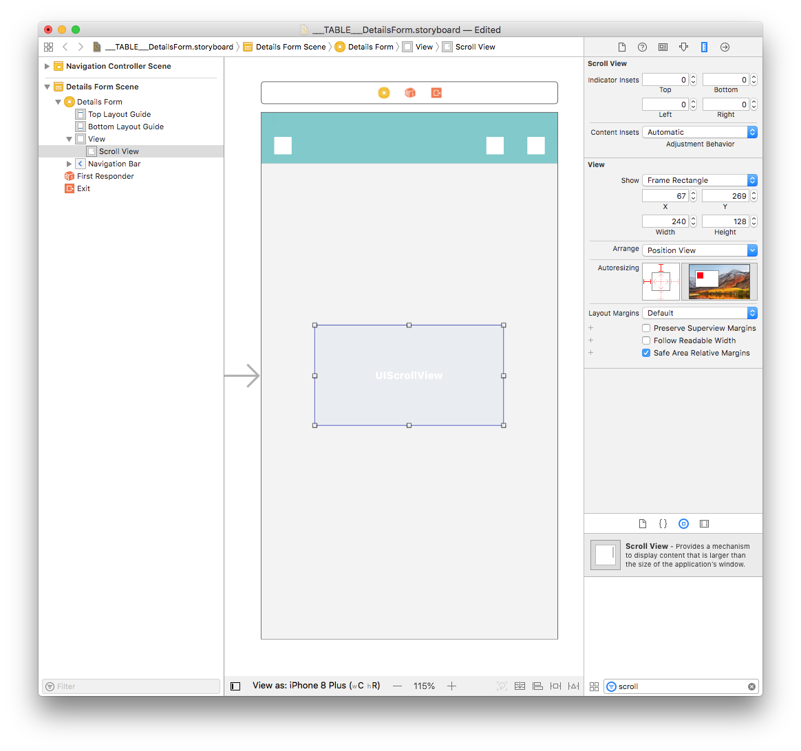
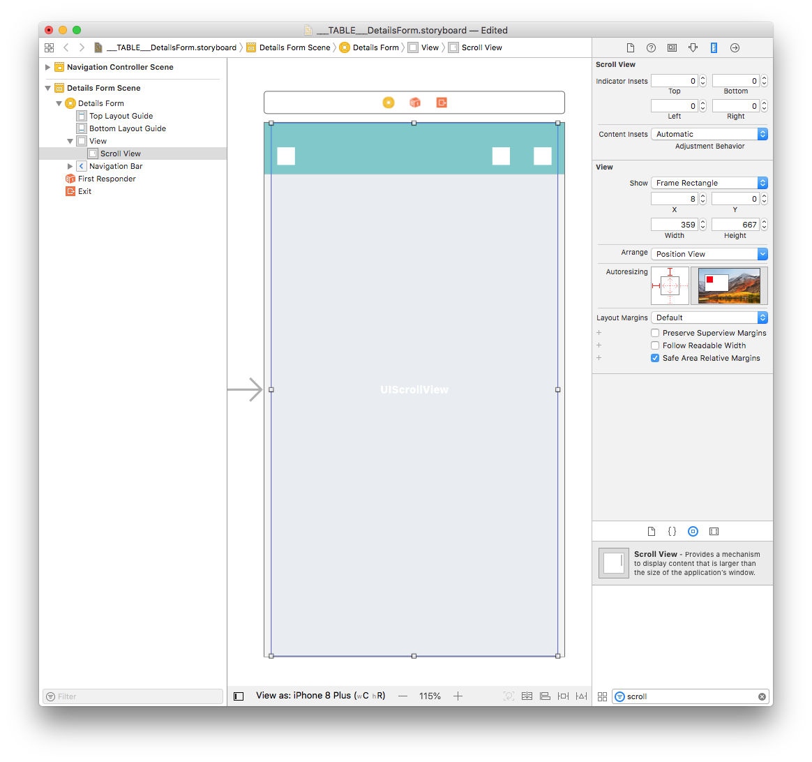
From the Size inspector panel (on the right side of the Interface Builder window), set the Scroll View Width value to 359 and the Height value to 667. Then set the X value to 8 and the Y value to 0.
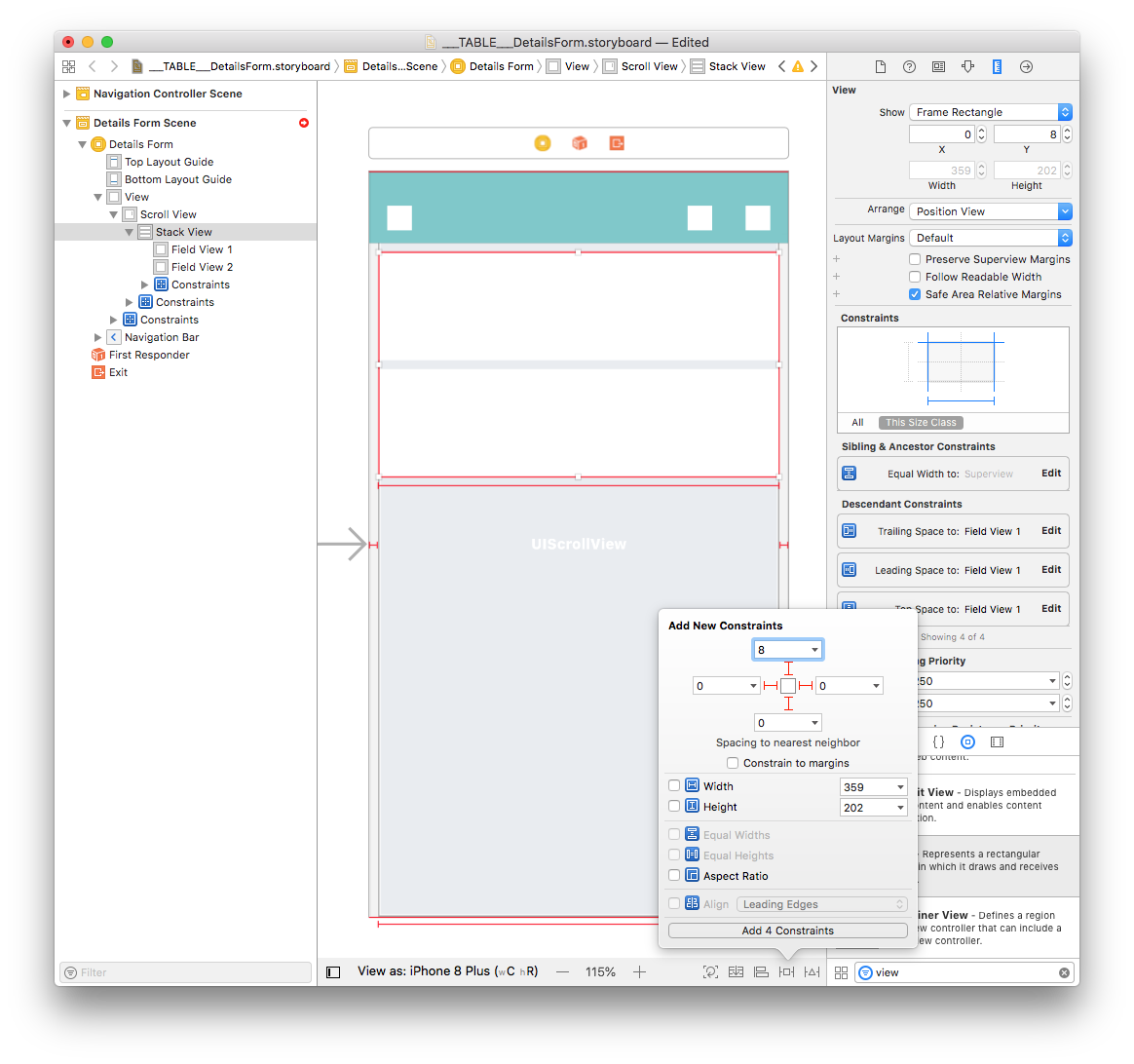
Next, add four constraints by clicking on the Add New Constraints button (Trailing: 8, Leading: 8, Top: 0, and Bottom: 0) as shown below:
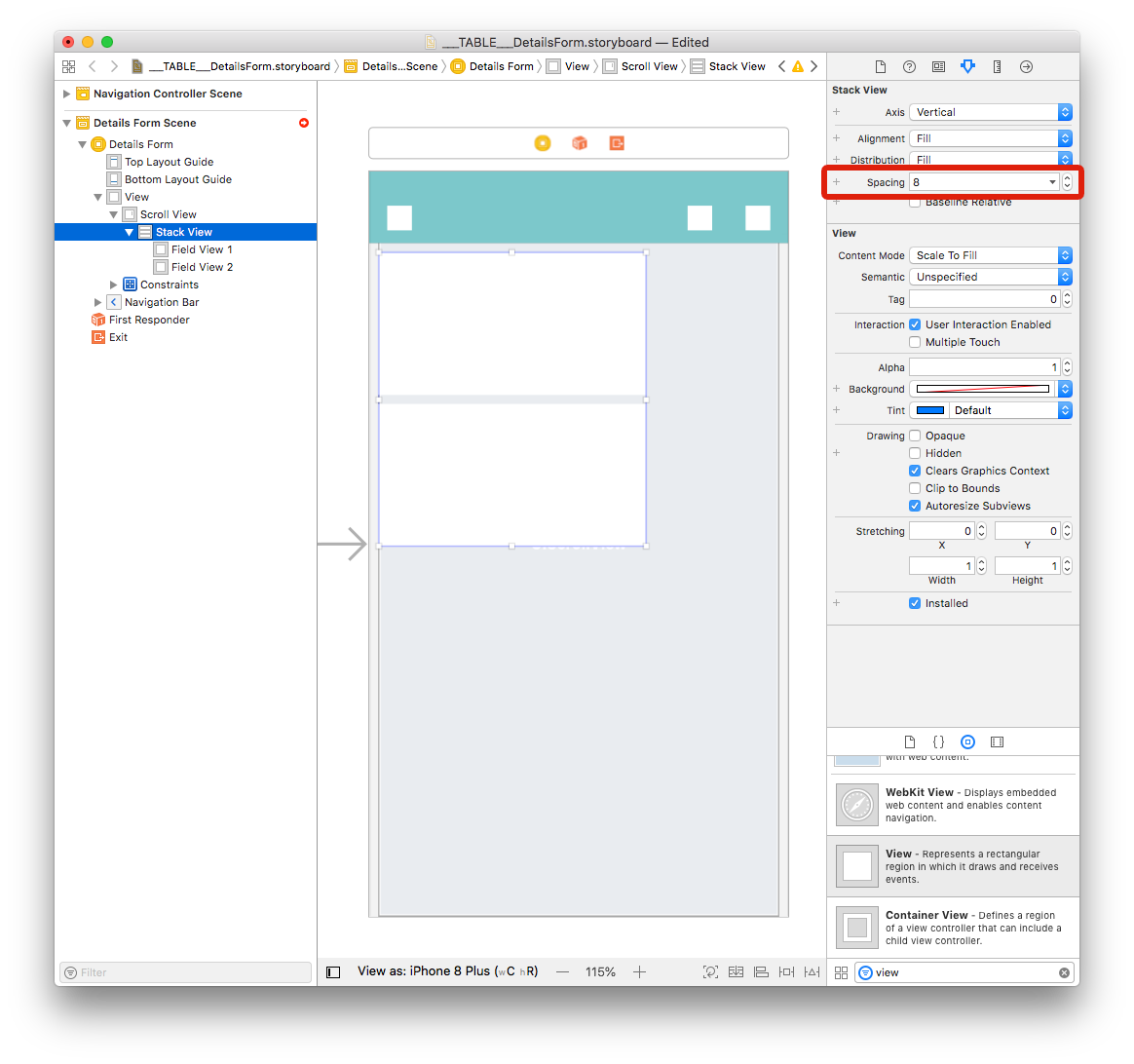
Add a Vertical Stack View
Drag and drop a Vertical Stack View from the Object library in Scroll View. Then, from the Size inspector panel (on the right side of the Interface Builder window) set the Width value to 359 and the Height value to 202. Finally, set the X value to 0 and the Y value to 8.
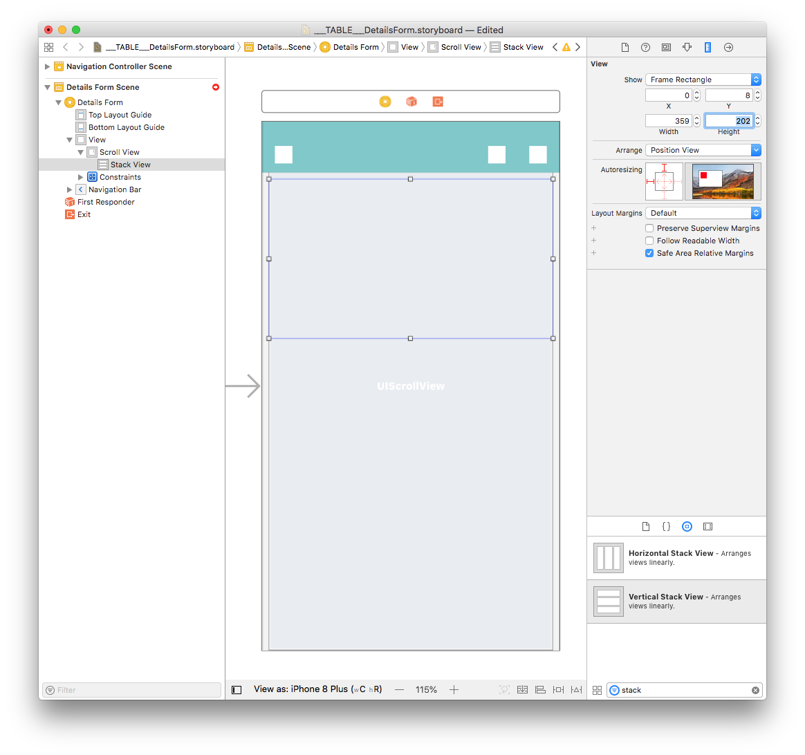
Since the Stack View width and height are defined by the elements inside it, we will configure the size and constraints later.
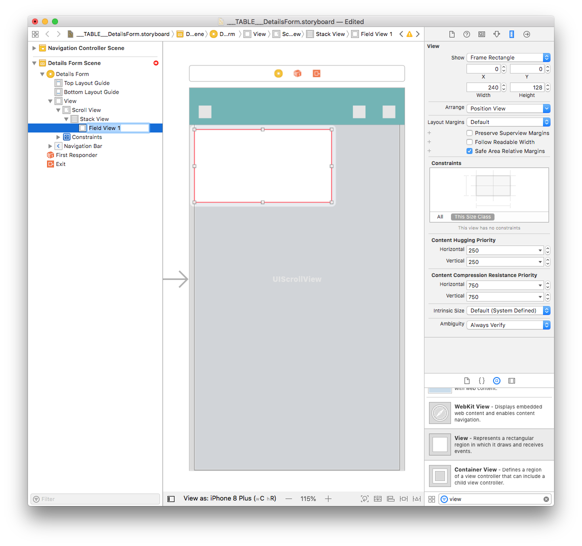
Add Views to the Stack Views
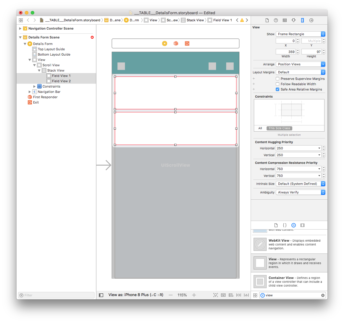
Drag and drop a view from the Object library to the Stack View you've just added to your storyboard. Let's name it Field View 1.
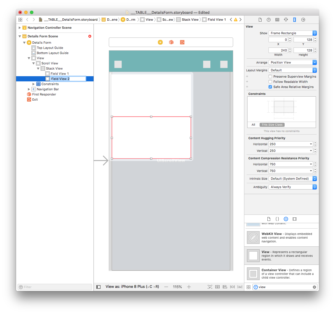
Then drag and drop another view from the Object library directly into the Document Outline at the same level as Field View 1 (to include it in the Stack View) and name it Field View 2.
To add space between the views, select your Stack View and set the spacing value to 8 (in the Attributes Inspector).
Select both Field View 1 and Field View 2 and in the Size inspector panel (on the right side of the Interface Builder window), set Width value to 359 and the Height value to 97.
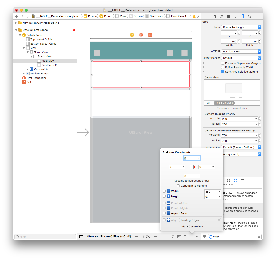
Select Field View 1 add three constraints by clicking on the Add New Constraints button (Trailing: 0, Leading: 0, and Top: 0):
For the Stack View to have the same width as the Scroll View, you need to add a constraint:
Press Ctrl and drag the Stack View to the Scroll View. When you release the mouse button, the Interface Builder displays a menu with a list of possible constraints. Choose Equal Width!
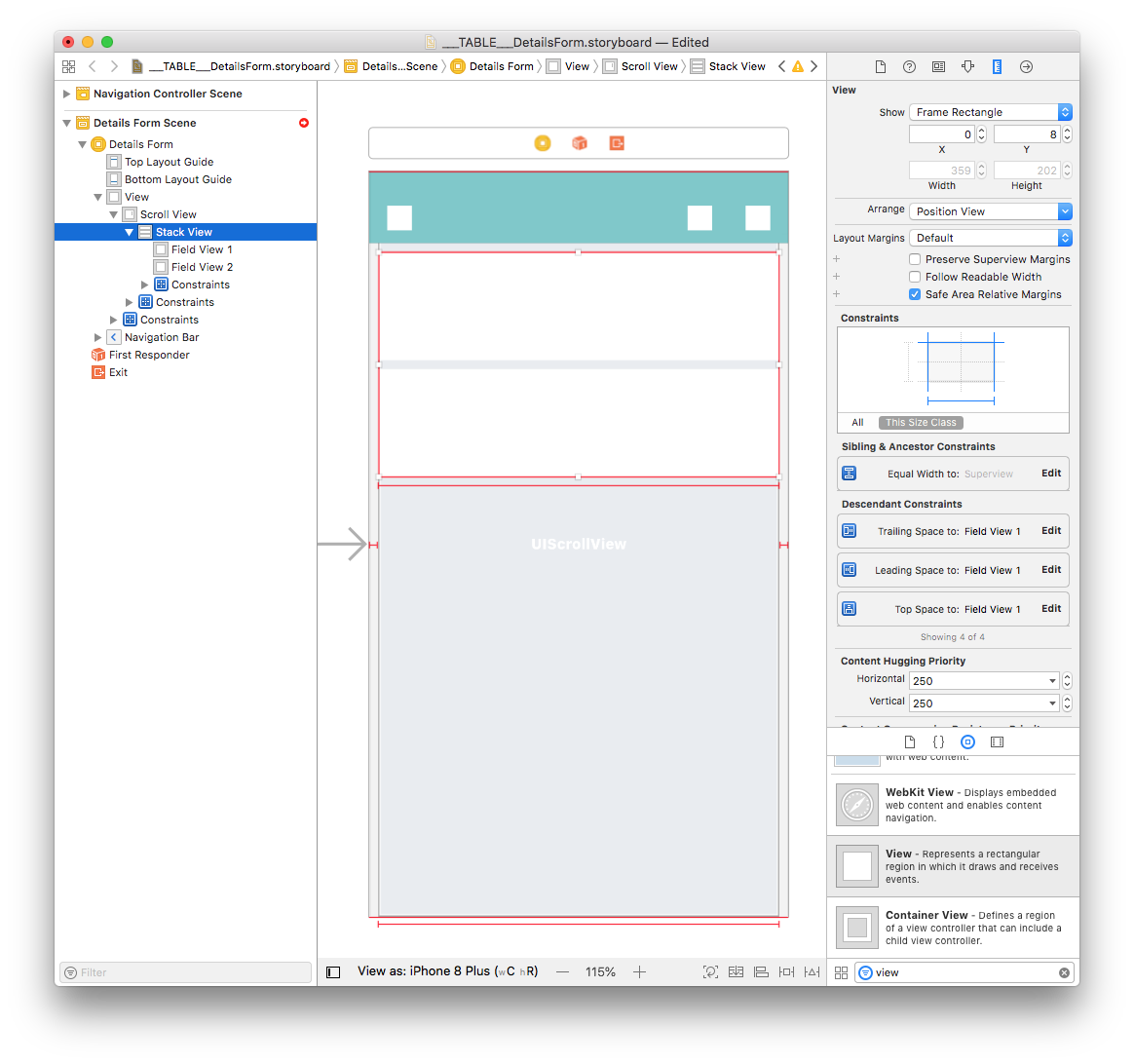
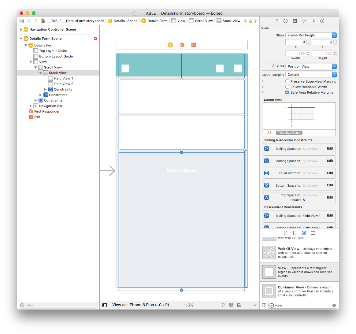
Next, with the Stack View selected add four constraints by clicking on the Add New Constraints button (Trailing: 0, Leading: 0, Top: 8, and Bottom: 0) as shown below:
Here's what you'll see when constraints have been added :
Now that you have two views in your Stack View and you've defined constraints, let's focus on Field View 1.
Add an Image View to Field View 1
From the Object library, drag and drop an Image View into Field View 1.
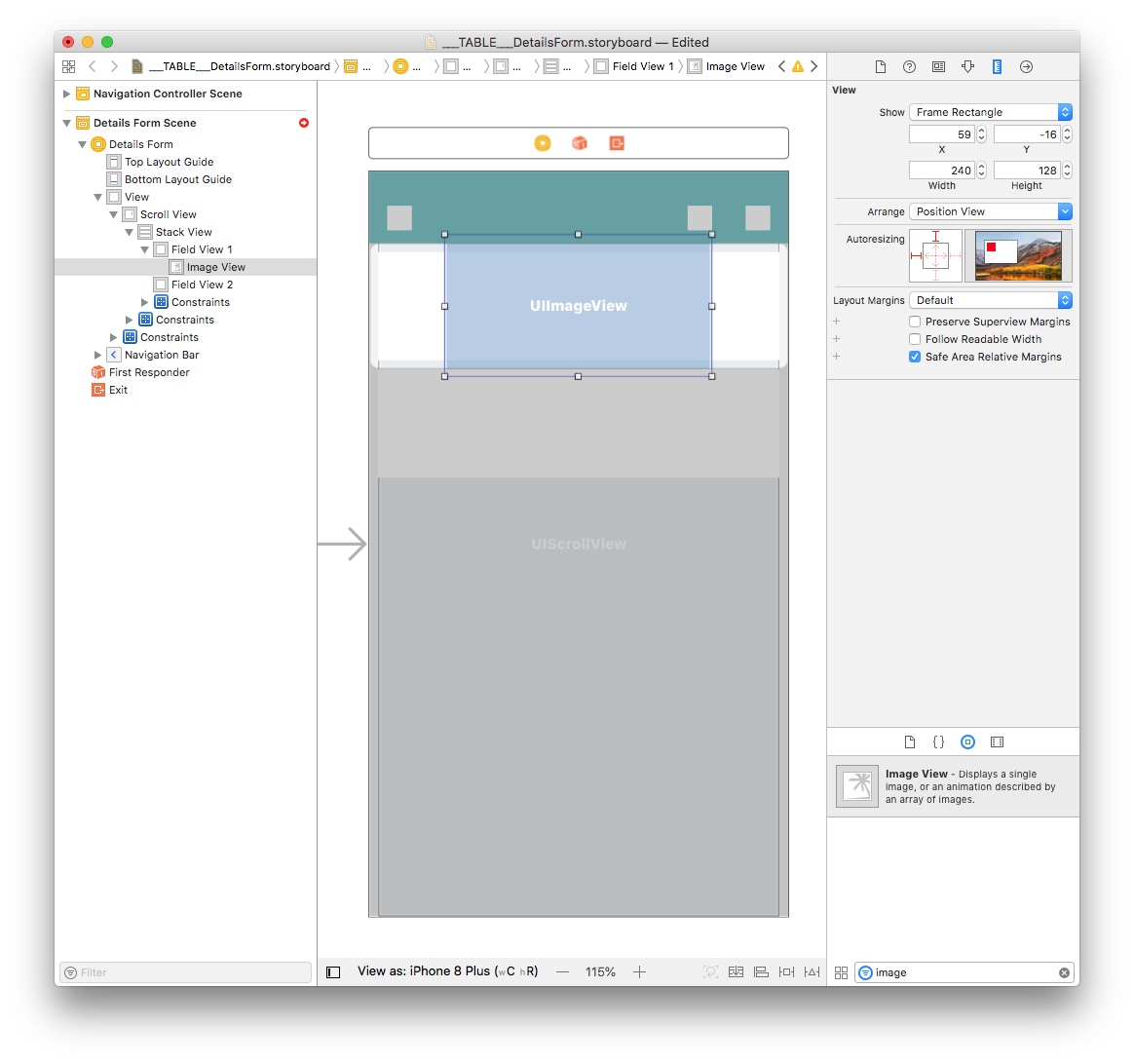
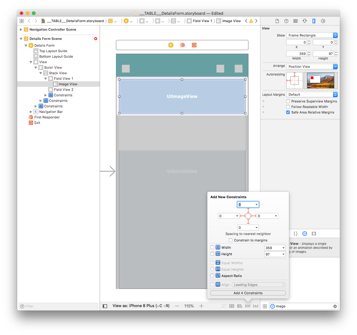
In the Size inspector panel (on the right side of the Interface Builder window), set the Image View Width value to 359 and the Height value to 97. Then set the X value to 0 and the Y value to 0.
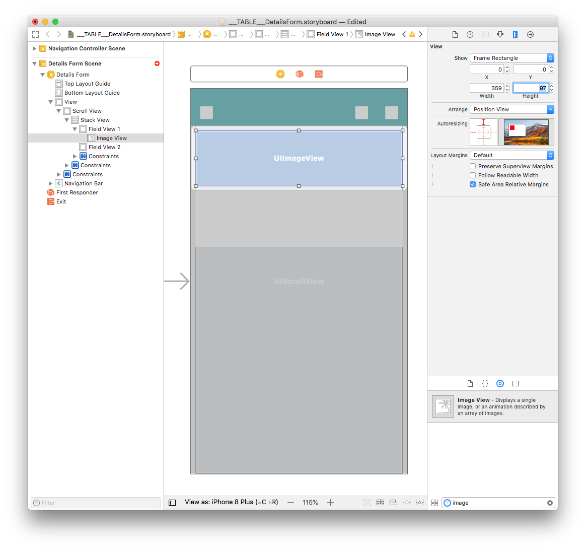
Next, add four constraints by clicking on the Add New Constraints button (Trailing:0, Leading:0, Top:0, and Bottom:0) as shown below:
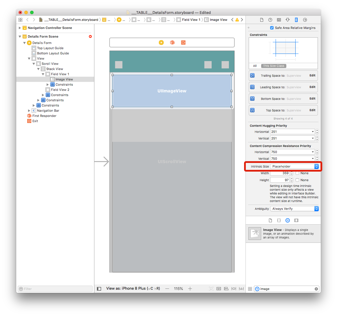
In the Size inspector panel change the Intrinsic Size from Default to Placeholder.
Add Labels to Field View 2
Title label
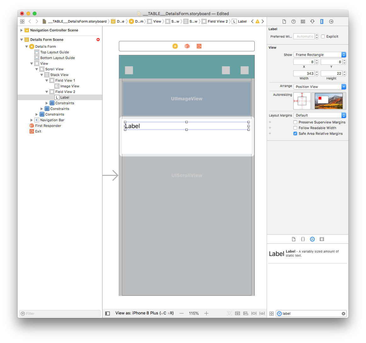
In the Object library, drag and drop a Label into Field View 2 and set the Width value to 343 and the Height value to 22. Then set the X value to 8 and the Y value to 8.
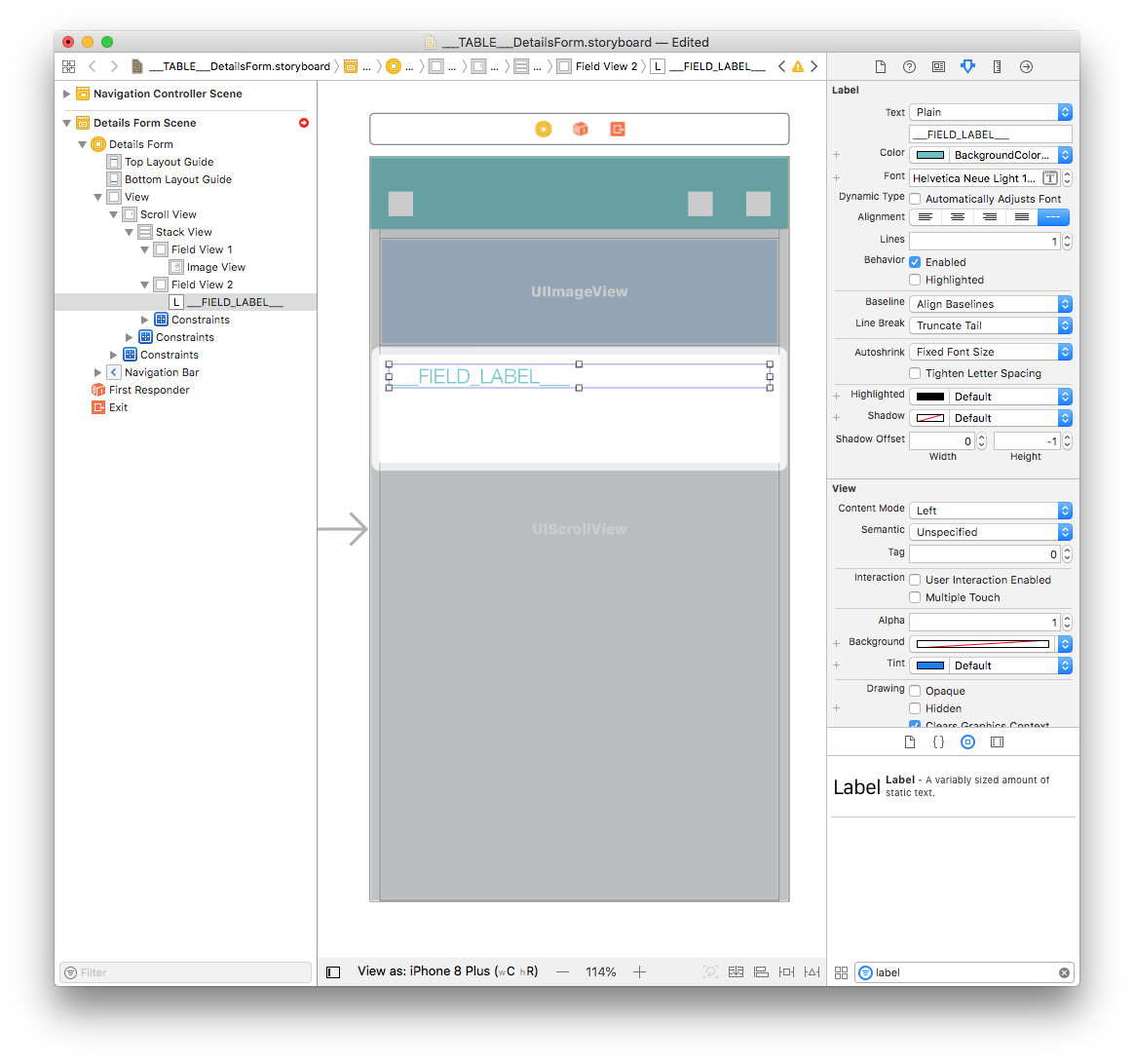
Double click on the label and name it "___FIELD_LABEL___". Then in the attribute inspector set the font to Helvetica Neue Light 18.0 and the color to BackgroundColor:
Content label
Duplicate the Title label and set the duplicate's Width value to 339 and the Height value to 44. Then set the X value to 12 and the Y value to 37.
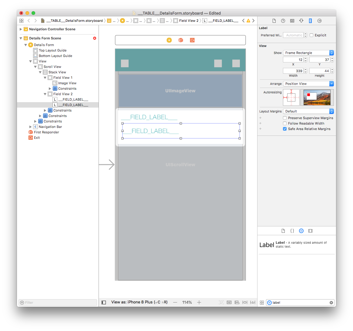
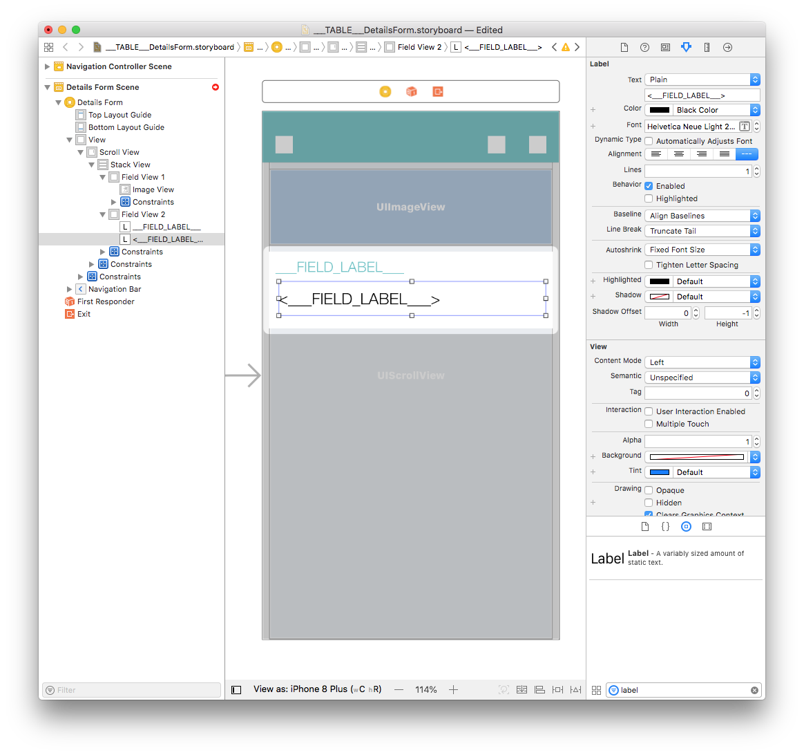
Double click on the label and name it "<___FIELD_LABEL___>". Then from the attribute inspector set the font to Helvetica Neue Light 20.0 and the color to Black Color:
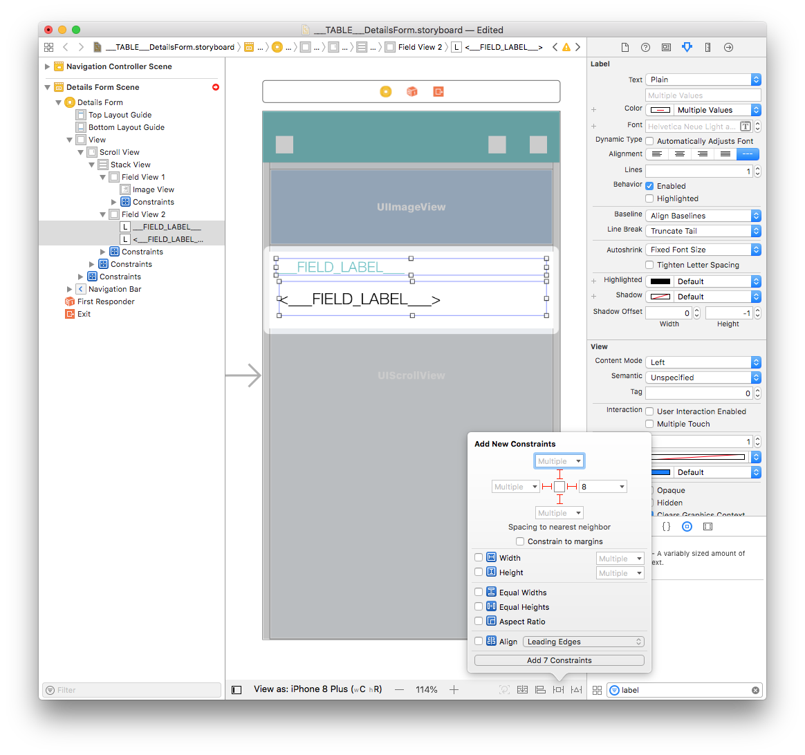
Select the Content and Title labels and add four constraints by clicking on the Add New Constraints button (Trailing: 8, Leading: Multiple, Top: Multiple, and Bottom: Multiple) as shown below:
You're done with graphical elements! All of your constraints are well defined.
How to get data into your cells
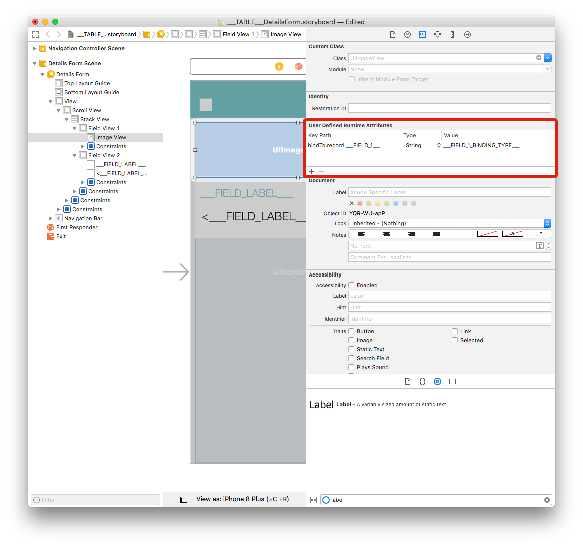
Image View
Select your Image View and go to Identity inspector > User Defined Runtime Attributes. Click the + button to add a row.
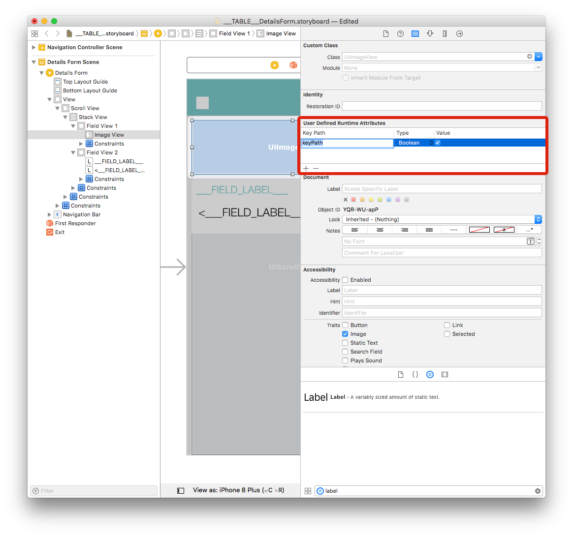
Key Path: Start with bindTo to activate binding on the component. Enter
bindTo.record.___FIELD_1___Type: Always
StringValue: The attribute name. Enter
___FIELD_1_BINDING_TYPE___
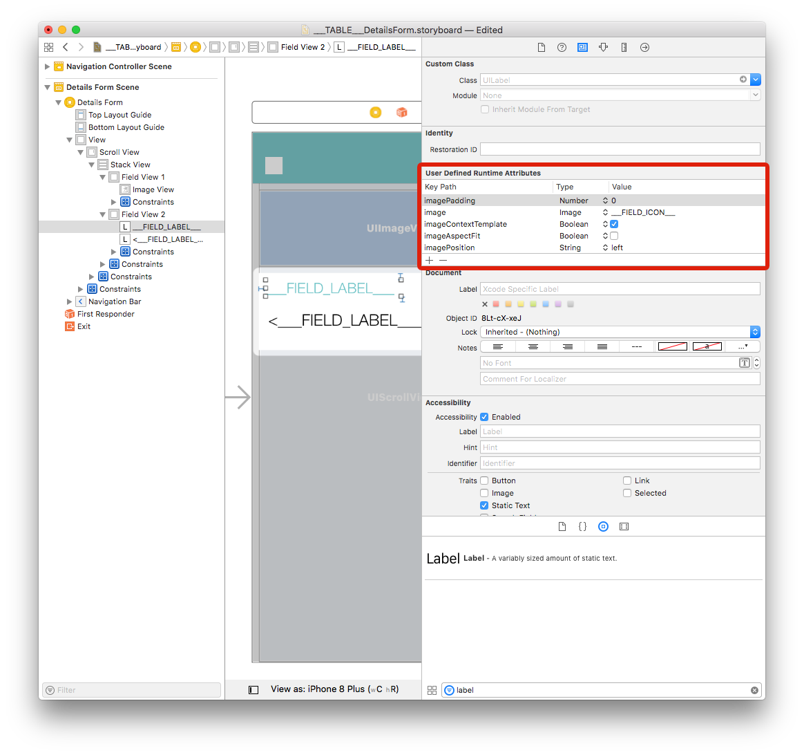
Labels
For the first label we are going to add several lines mainly to display icons:
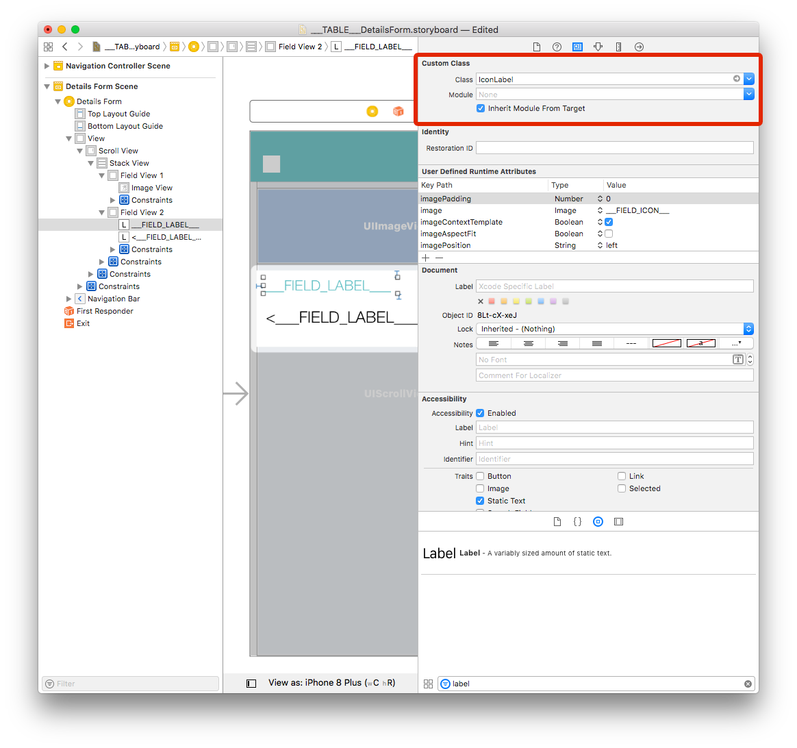
You also need to set the Class to IconLabel and check the Inherit Module From Target checkbox as we can see below:
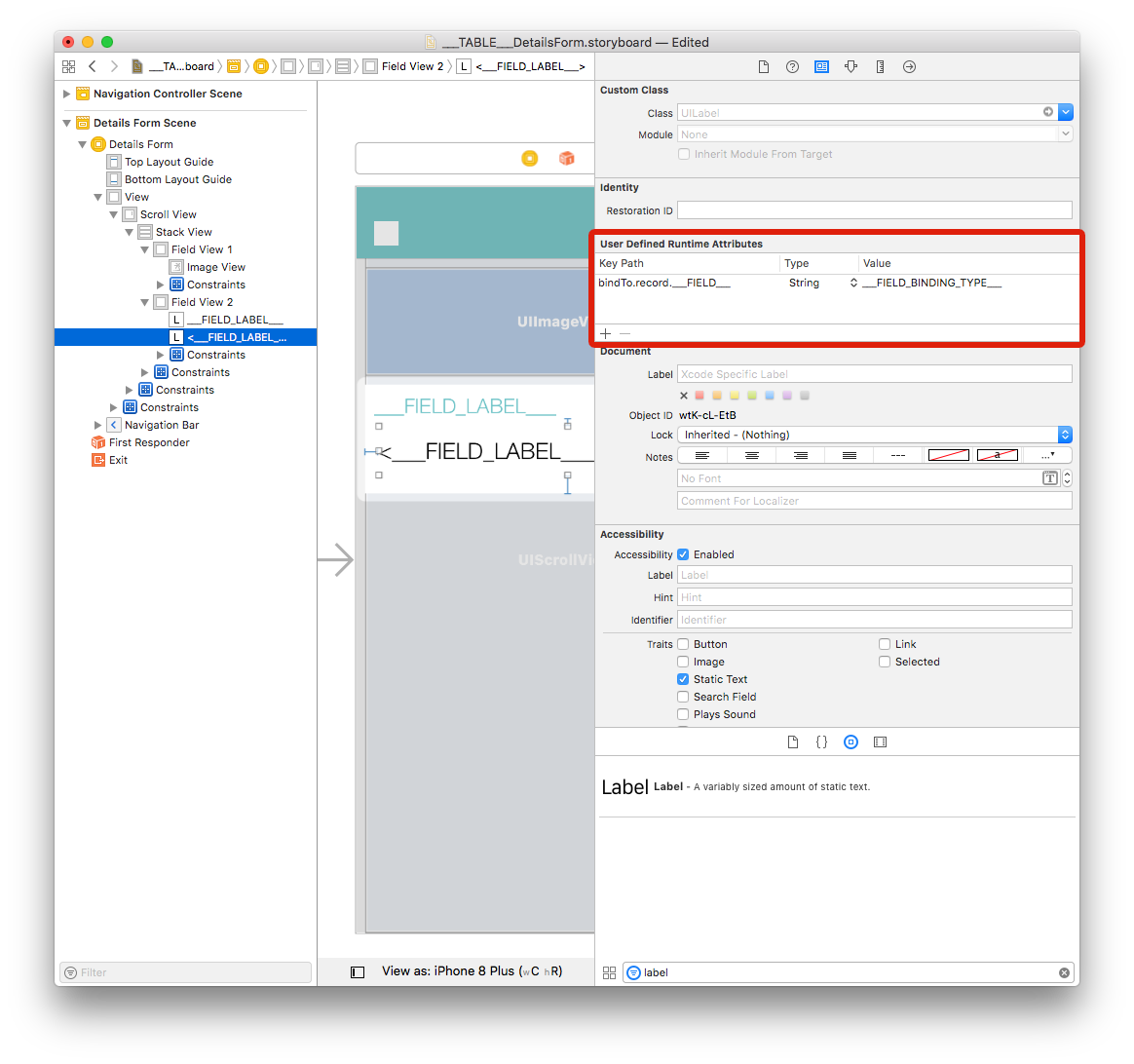
Select the second label and add a row in the Defined Runtime Attributes:
Key Path:
bindTo.record.___FIELD___Type:
StringValue:
___FIELD_BINDING_TYPE___
Add TAGS to the cells to be duplicated
Field View 2 includes elements that will be duplicated so you can have as many field as you define in the project editor.
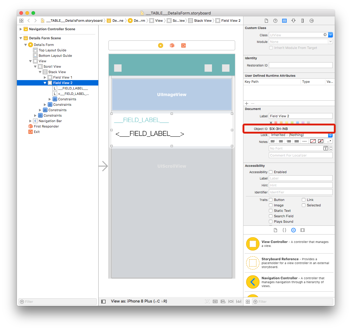
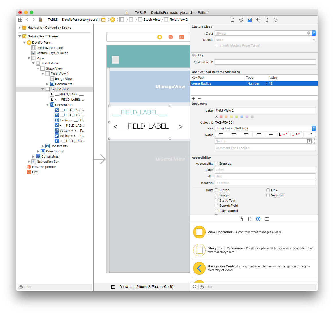
Each storyboard element has an Object ID. For example, if you select Field View 2 and go to the Identity inspector, you'll see its Object ID:
In order to tell the project editor that all of the elements included in this view will be duplicated, we need to add TAG to each element and constraints.
The process is a little bit tricky... Let's begin by opening the storyboard file with your favorite code editor!
Field View 2
Select Field View 2 and get its Object ID from the Identity Inspector (on the right side of the Interface Builder window). In our project, Field View 2 ID is: SiX-3H-lNB.
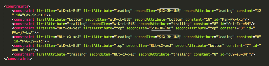
Search for this ID in the storyboard xml code and replace it with TAG-FD-001 each time it appears. As you can see, this Object ID is mentioned several times so be careful!
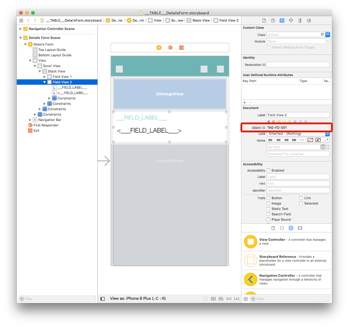
Save the storyboard xml file. As you can see, the Field View 2 Object ID has changed in your storyboard in Xcode:
First label
- Now, get the first label Object ID from the Identity Inspector and replace it with TAG-FD-002 each time it appears in the storyboard xml code.
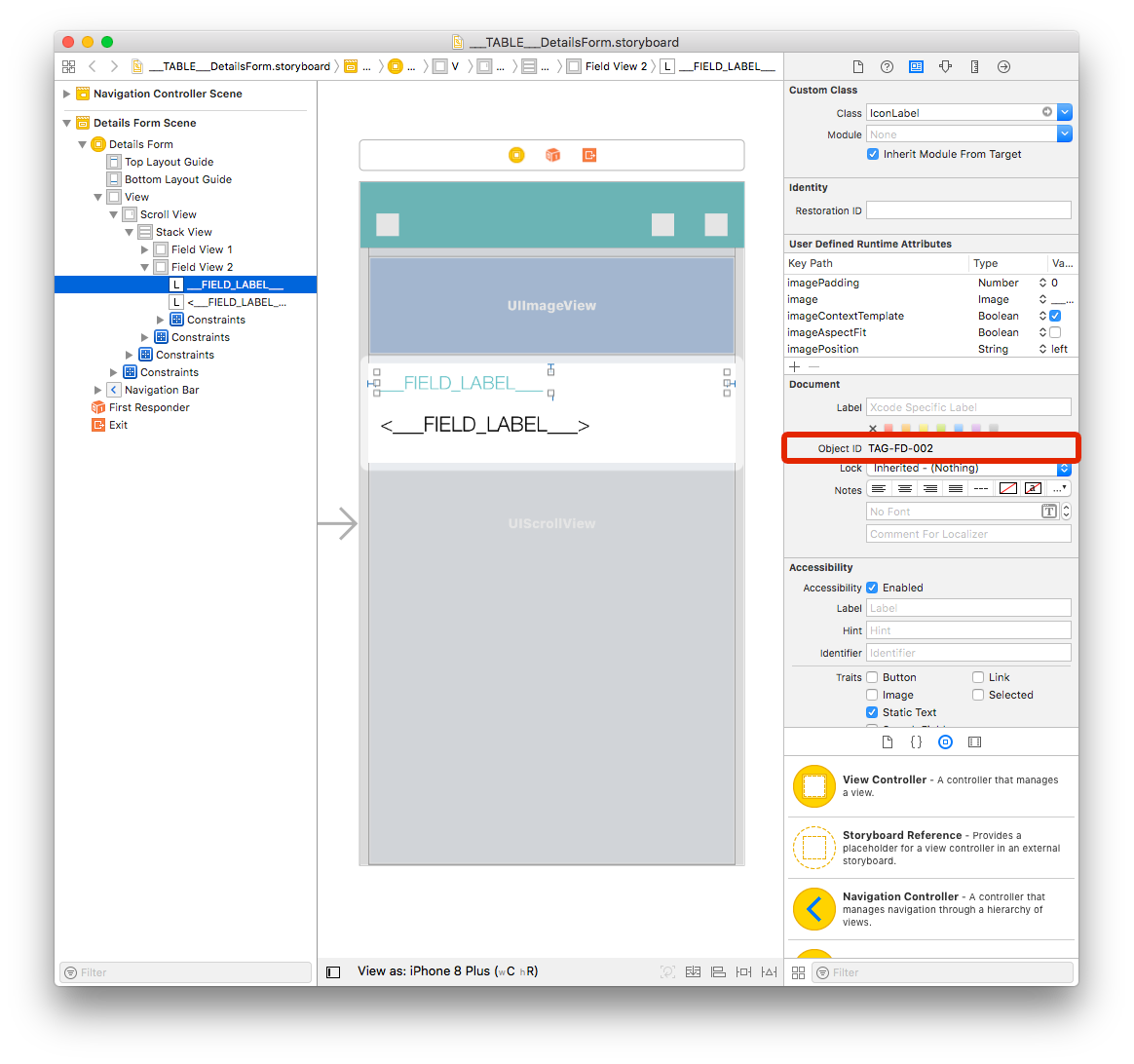
Done with the first label.
Second label
- Next, get the second label Oject ID from the Identity Inspector and replace it with TAG-FD-003 each time it appears in the storyboard xml code.

Voilà!
Constraints
Both labels have constraints that we need to tag, too:
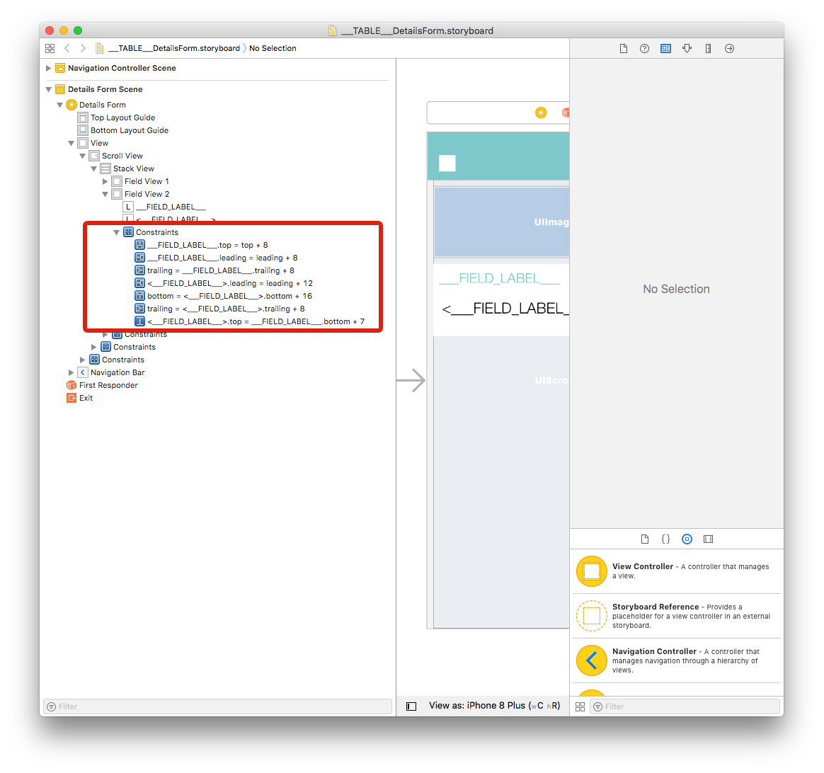
Just like View Field 2 and label, get all 7 Constraints Object IDs from the Identity Inspector and replace them with: TAG-FD-004, TAG-FD-005, TAG-FD-006, TAG-FD-007, TAG-FD-008, TAG-FD-009 and TAG-FD-010.
Go to your project editor and select your detail template from the Forms section, then click on Build.
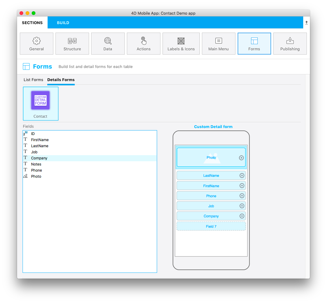
Not bad for a first attempt!
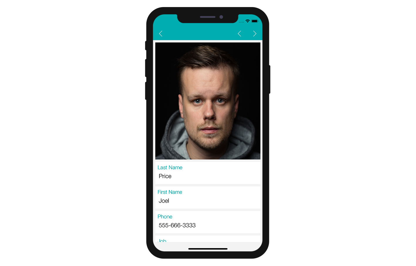
Field View 2 is well duplicated! Let's see if we can make this app a bit more interesting!
Customize your app
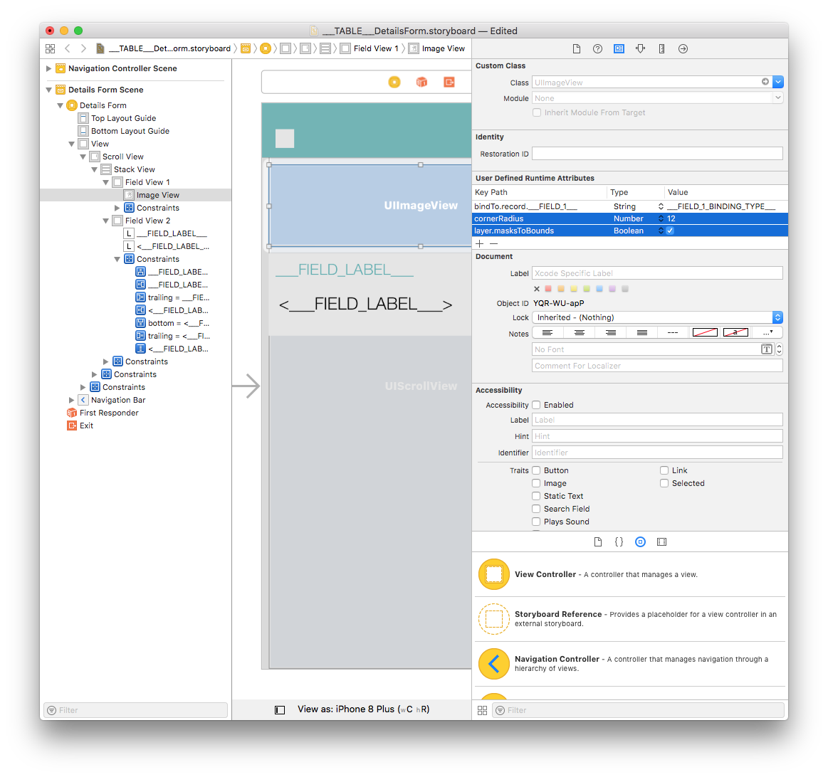
We're going to add a corner radius to the Image View, as well as Field View 2.
Select your Image View and add the two following lines in the User Defined Runtime Attributes:
Key Path:
cornerRadiusType:
NumberValue:
12
and
Key Path:
layer.masksToBoundsType:
BooleanValue: Check the box
Next, select Field View 2 and add the following:
Key Path:
cornerRadiusType:
NumberValue:
12
You can now build your project from the project editor!
Where to go from here?
In this tutorial, we've covered the basics for creating detail form templates. You can now create simple templates on your own using the Starter project resources.
Download the completed template folder: