Android Layout
In this section you will see how to create your Android list form interface with Android Studio.
Here's the result we want to achieve:
For each cell, we're going to add a:
- Profile image
- Title
- Subtitle
Open the layout file with Android Studio
The best way to edit or create a template is to :
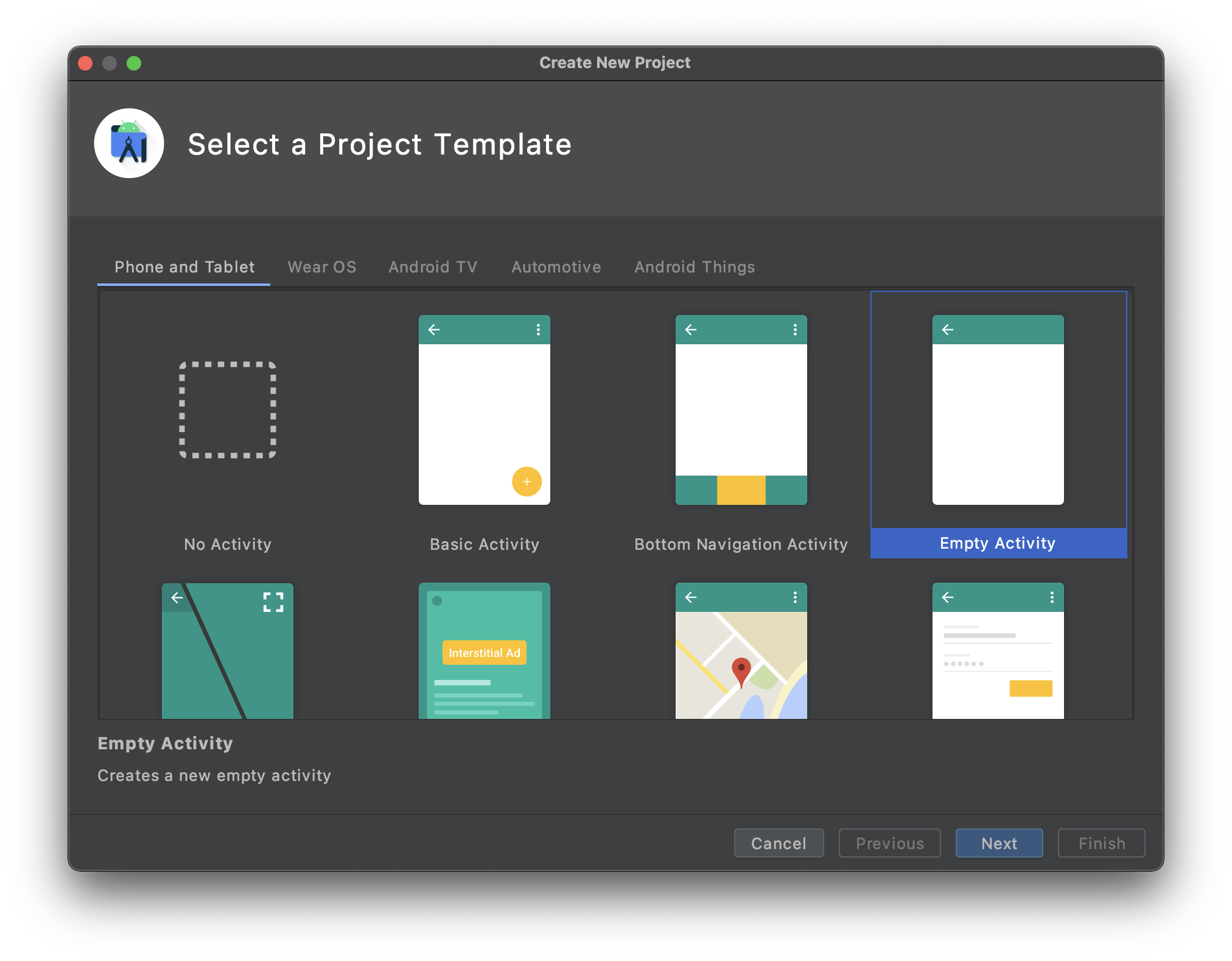
Open Android Studio and create a new empty mobile project clicking on File > New > New Project...
Select the Empty Activity template
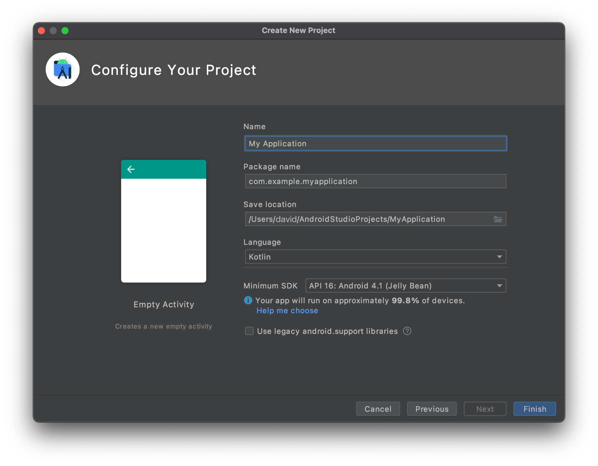
- Configure your project and click Finish
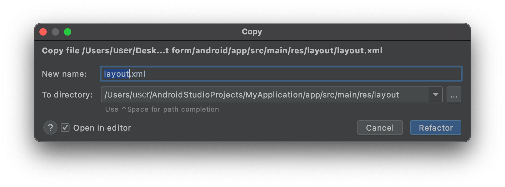
- Copy the layout.xml file in app > res > layout dropping it directly on the project layout folder
- You should have that at that point :
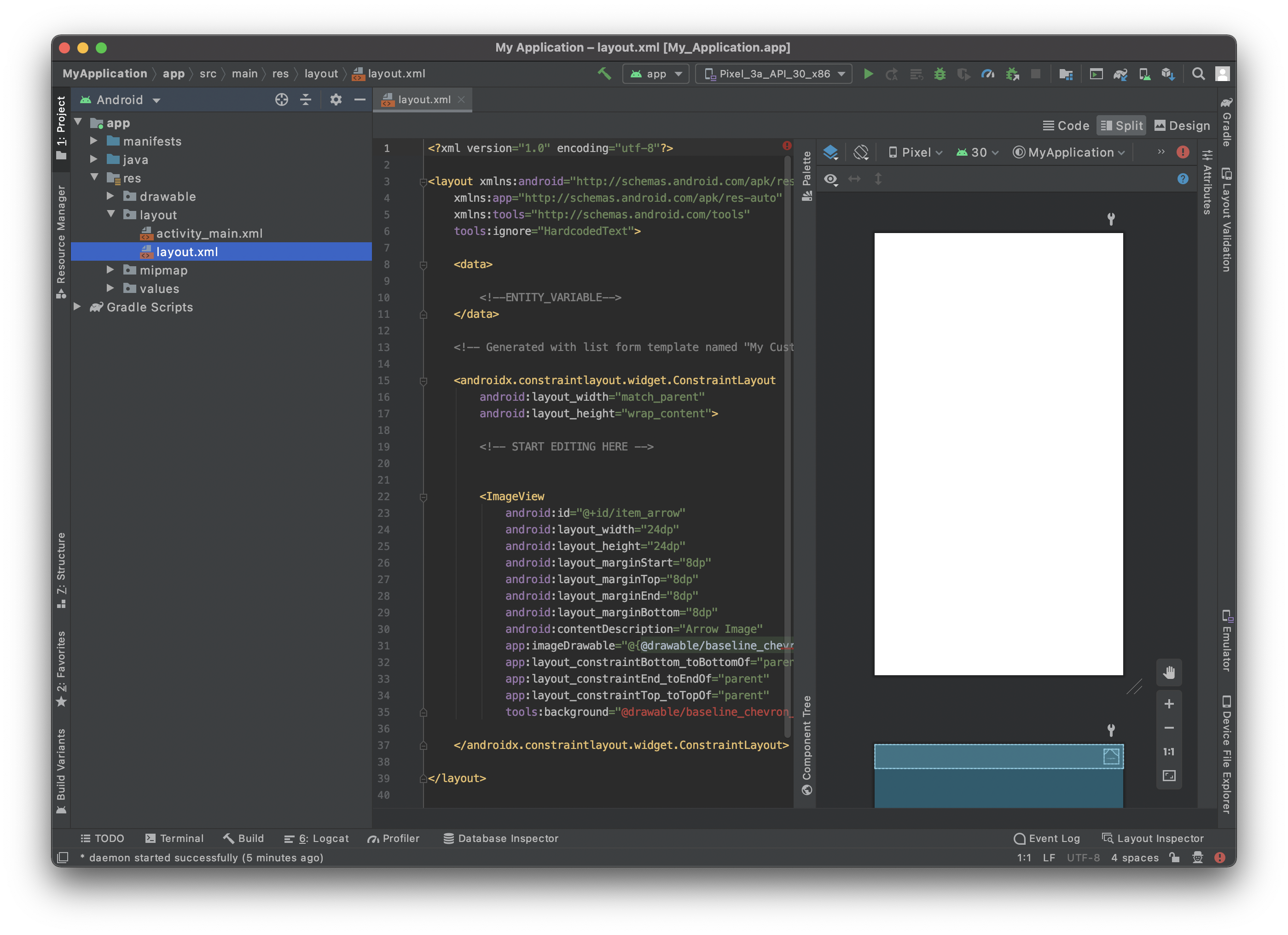
- Click on the top right Split option to visualize the template preview as well as the xml code.
It's quite empty, so let's add some content!
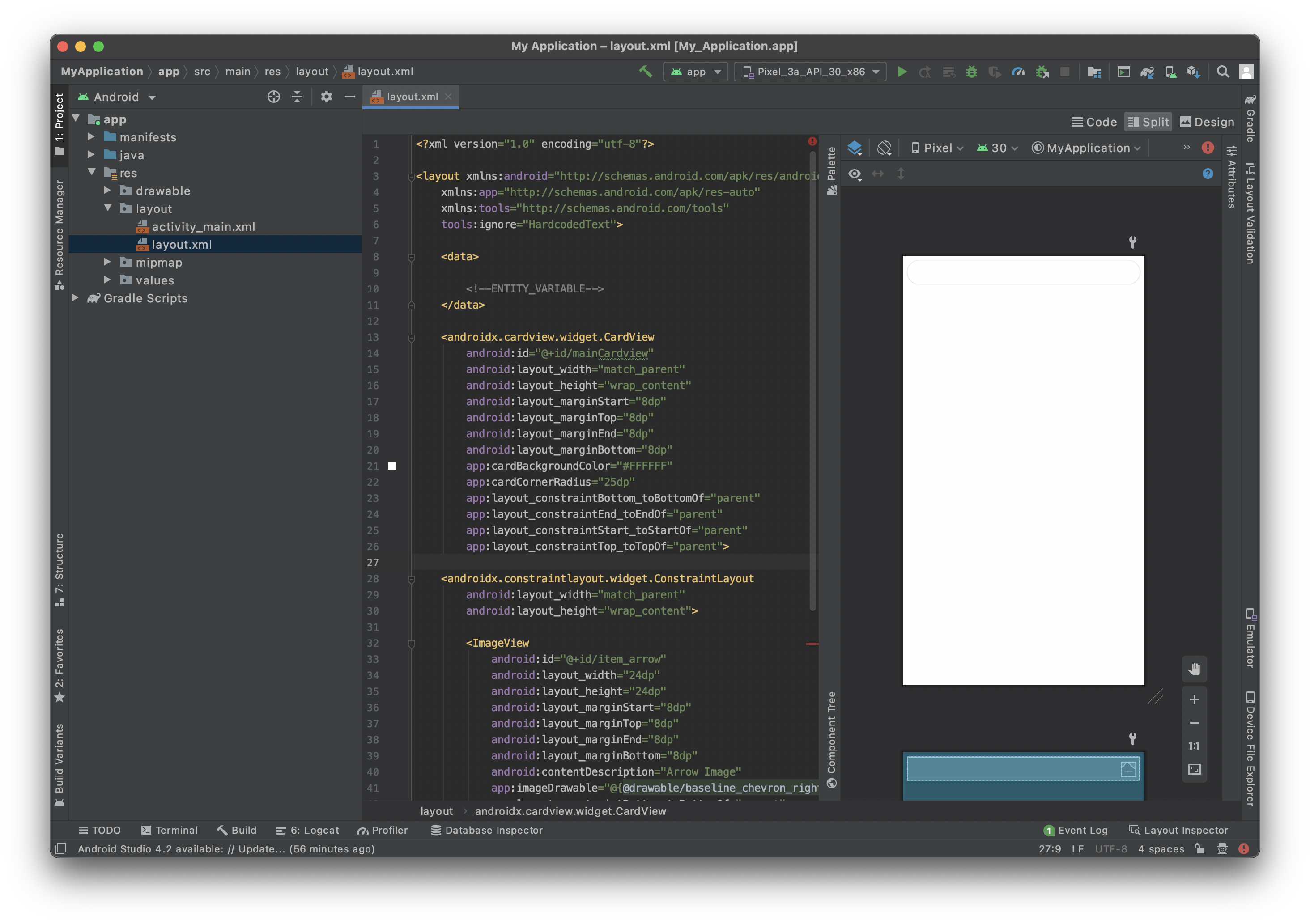
Add a CardView container
To have a better rendering of your cells we are going to add a CardView.
Adding a CardView container will allow you to display your list form cells as nice cards and gives you the ability to add shadow, elevation, corner radius, background color...
So let's add it to your layout file. Don't forget to close the container adding </androidx.cardview.widget.CardView> just before </layout>.
   <androidx.cardview.widget.CardView
        android:id="@+id/mainCardview"
        android:layout_width="match_parent"
        android:layout_height="wrap_content"
        android:layout_marginStart="8dp"
        android:layout_marginTop="8dp"
        android:layout_marginEnd="8dp"
        android:layout_marginBottom="8dp"
        app:cardBackgroundColor="#FFFFFF"
        app:cardCornerRadius="25dp"
        app:layout_constraintBottom_toBottomOf="parent"
        app:layout_constraintEnd_toEndOf="parent"
        app:layout_constraintStart_toStartOf="parent"
        app:layout_constraintTop_toTopOf="parent">

        ...

        </androidx.cardview.widget.CardView>
It is crucial to give ids to your layout elements to refer to it later and positioning them among themselves.
Define the width and height of your container, the margins and as we want the content to take all the parent space (minus the margins) we just have to add constraints.
Here is the full layout code at this stage :
<?xml version="1.0" encoding="utf-8"?>

<layout xmlns:android="http://schemas.android.com/apk/res/android"
    xmlns:app="http://schemas.android.com/apk/res-auto"
    xmlns:tools="http://schemas.android.com/tools"
    tools:ignore="HardcodedText">

    <data>
        <!--ENTITY_VARIABLE-->
    </data>

    <androidx.cardview.widget.CardView
        android:id="@+id/mainCardview"
        android:layout_width="match_parent"
        android:layout_height="wrap_content"
        android:layout_marginStart="8dp"
        android:layout_marginTop="8dp"
        android:layout_marginEnd="8dp"
        android:layout_marginBottom="8dp"
        app:cardBackgroundColor="#FFFFFF"
        app:cardCornerRadius="25dp"
        app:layout_constraintBottom_toBottomOf="parent"
        app:layout_constraintEnd_toEndOf="parent"
        app:layout_constraintStart_toStartOf="parent"
        app:layout_constraintTop_toTopOf="parent">

        <androidx.constraintlayout.widget.ConstraintLayout
        android:layout_width="match_parent"
            android:layout_height="wrap_content">

        </androidx.constraintlayout.widget.ConstraintLayout>

    </androidx.cardview.widget.CardView>


</layout>
And here is the preview result you are supposed to get :
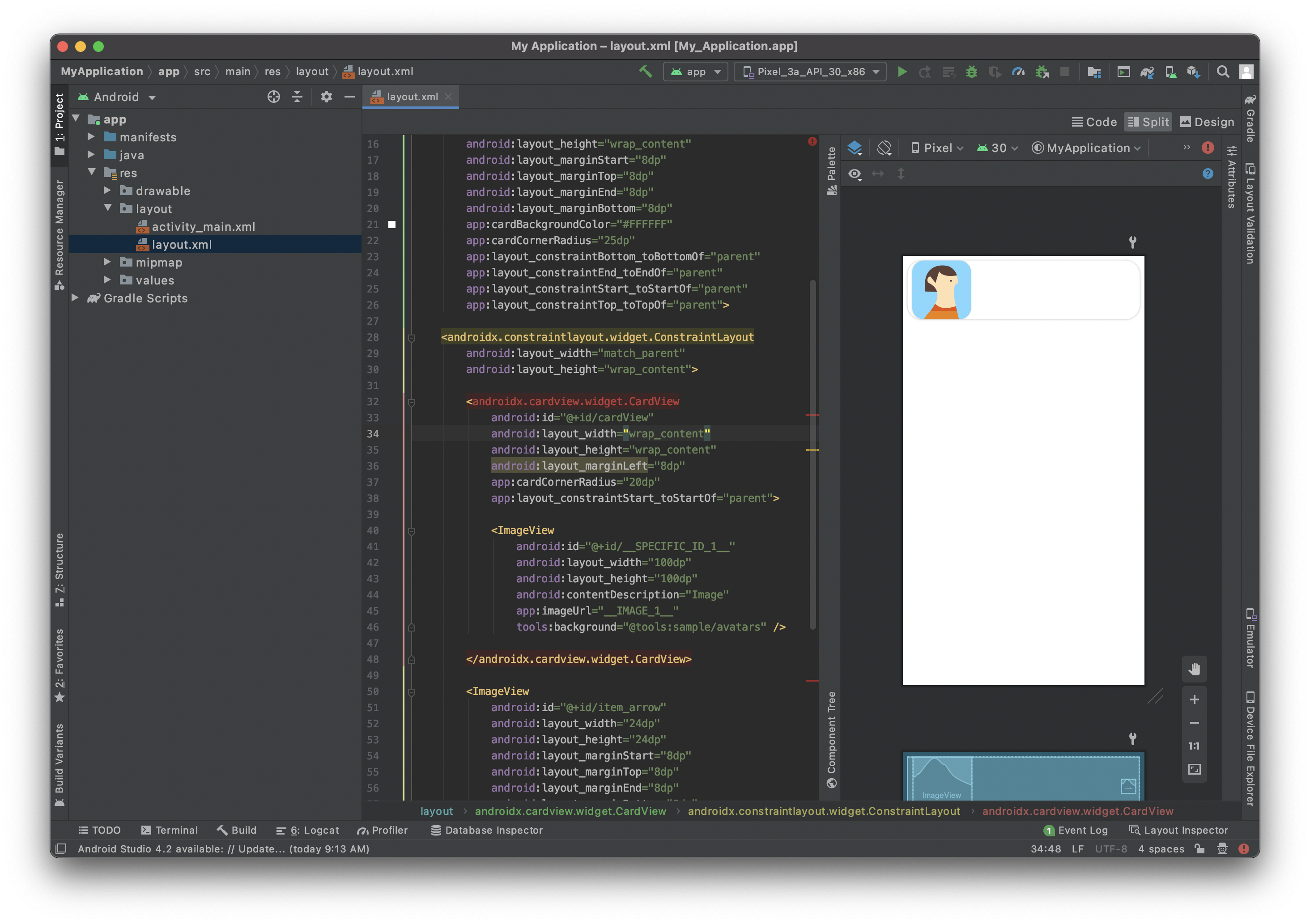
Add an ImageView
In order to have a nice Image view display we are going to use agin a CardView container again as we want to add a nice corner radius to the ImageView to have a better design.
            <androidx.cardview.widget.CardView
                android:id="@+id/cardView"
                android:layout_width="wrap_content"
                android:layout_height="wrap_content"
                android:layout_marginStart="8dp"
                app:cardCornerRadius="20dp"
                app:layout_constraintStart_toStartOf="parent"

            <ImageView
                android:id="@+id/__SPECIFIC_ID_1__"
                android:layout_width="100dp"
                android:layout_height="100dp"
                android:contentDescription="Image"
                app:imageUrl="__IMAGE_1__"
                tools:background="@tools:sample/avatars" />

            </androidx.cardview.widget.CardView>
As you can see the ImageView is embedded into the CardView. That allows to add corner radius to it.
The app:imageUrl="__IMAGE_1__" line will allow to bind image value that is situated in position 1 in the svg file that you previously defined.
The tools:background="@tools:sample/avatars" line simply there to display an ImageView placeholder.
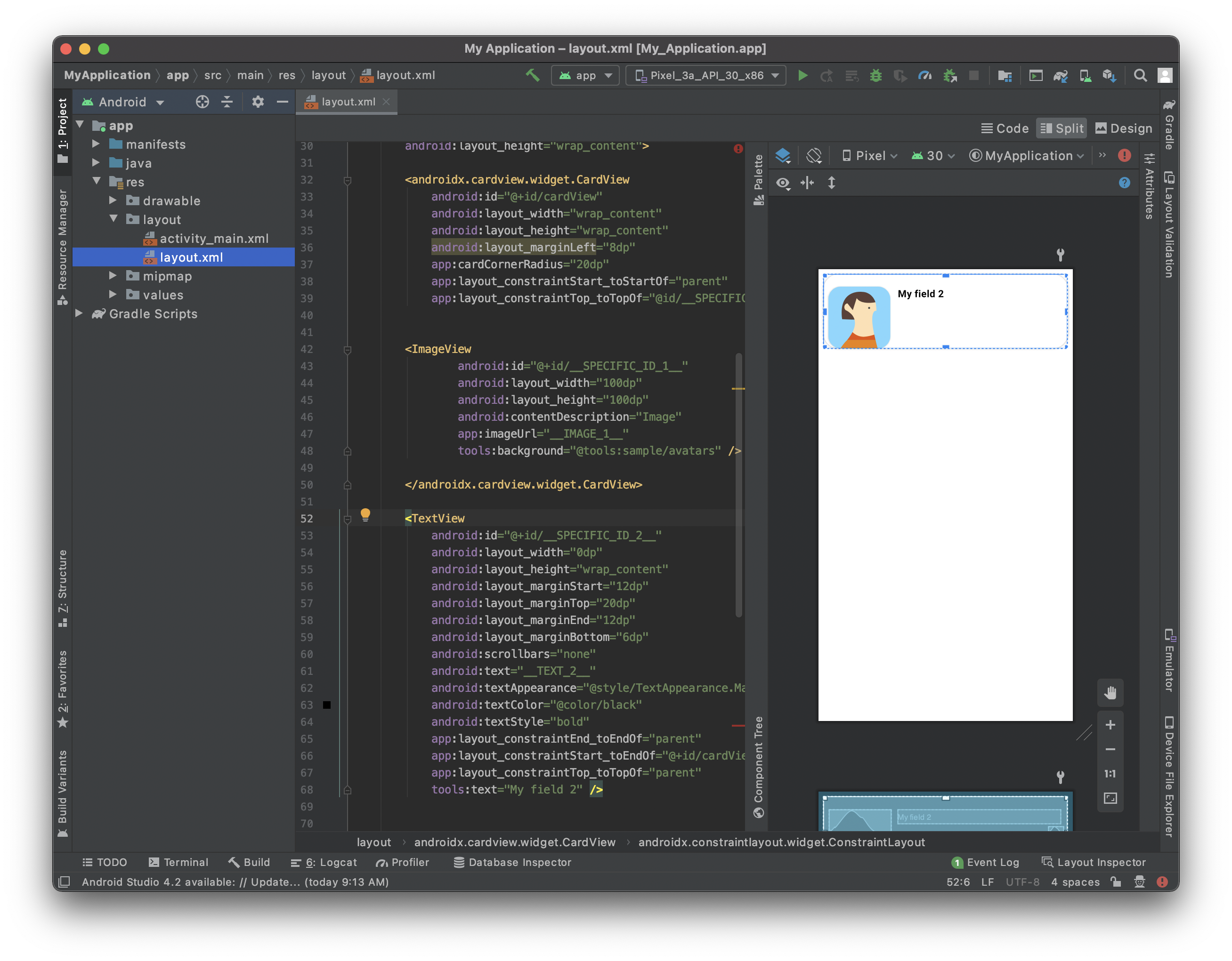
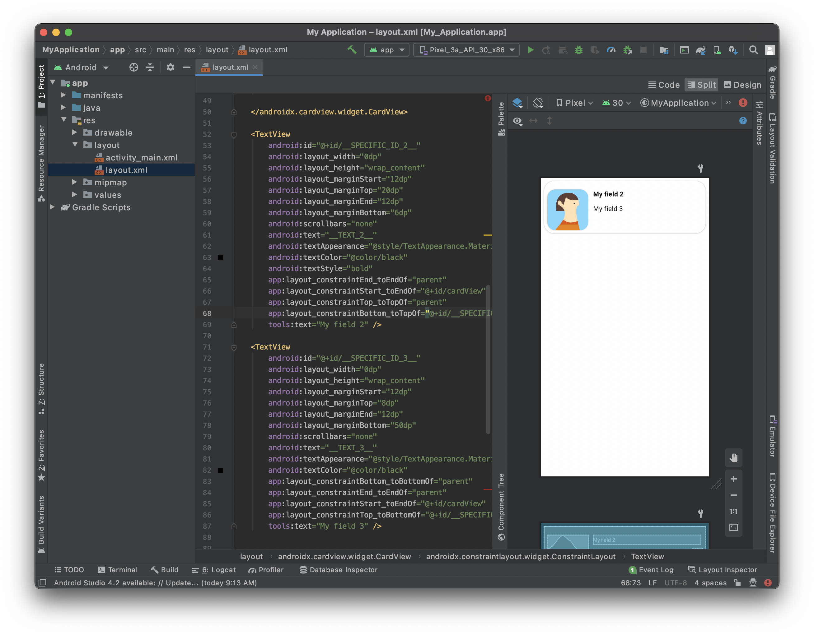
Add a title
Here we want to add a title at the right of the CardView that contains an ImageView.
To do so we are going to add a TextView :
 <TextView
                android:id="@+id/__SPECIFIC_ID_2__"
                android:layout_width="0dp"
                android:layout_height="wrap_content"
                android:layout_marginStart="12dp"
                android:layout_marginTop="20dp"
                android:layout_marginEnd="12dp"
                android:layout_marginBottom="6dp"
                android:scrollbars="none"
                android:text="__TEXT_2__"
                android:textAppearance="@style/TextAppearance.MaterialComponents.Body1"
                android:textColor="@color/black"
                android:textStyle="bold"
                app:layout_constraintEnd_toEndOf="parent"
                app:layout_constraintStart_toEndOf="@+id/cardView"
                app:layout_constraintTop_toTopOf="parent"
                tools:text="My field 2" />
The app: text="__TEXT_2__" line will allow to bind text value that is situated in position 2 in the svg file that you previously defined.
We want to ImageView and the TextView to be top aligned. To do so, we are going to use the TextView id. You just have to add this line to the CardView that include the profile picture :
app:layout_constraintTop_toTopOf="@id/__SPECIFIC_ID_2__"
Add a subtitle
We want to add a subtitle to this cell. For that you just have to add quite the same block as the title one:
<TextView
                android:id="@+id/__SPECIFIC_ID_3__"
                android:layout_width="0dp"
                android:layout_height="wrap_content"
                android:layout_marginStart="12dp"
                android:layout_marginTop="8dp"
                android:layout_marginEnd="12dp"
                android:layout_marginBottom="50dp"
                android:scrollbars="none"
                android:text="__TEXT_3__"
                android:textAppearance="@style/TextAppearance.MaterialComponents.Body1"
                   android:textColor="?colorPrimary"
                app:layout_constraintBottom_toBottomOf="parent"
                app:layout_constraintEnd_toEndOf="parent"
                app:layout_constraintStart_toEndOf="@+id/cardView"
                app:layout_constraintTop_toBottomOf="@+id/__SPECIFIC_ID_2__"
                tools:text="My field 3" />
The app: text="__TEXT_3__" line will allow to bind text value that is situated in position 2 in the svg file that you previously defined.
We want to the subtitle to be at the bottom of the title. To do so, we are going to use the title TextView id. You just have to add this line to title TextView :
app:layout_constraintBottom_toTopOf="@+id/__SPECIFIC_ID_3__"
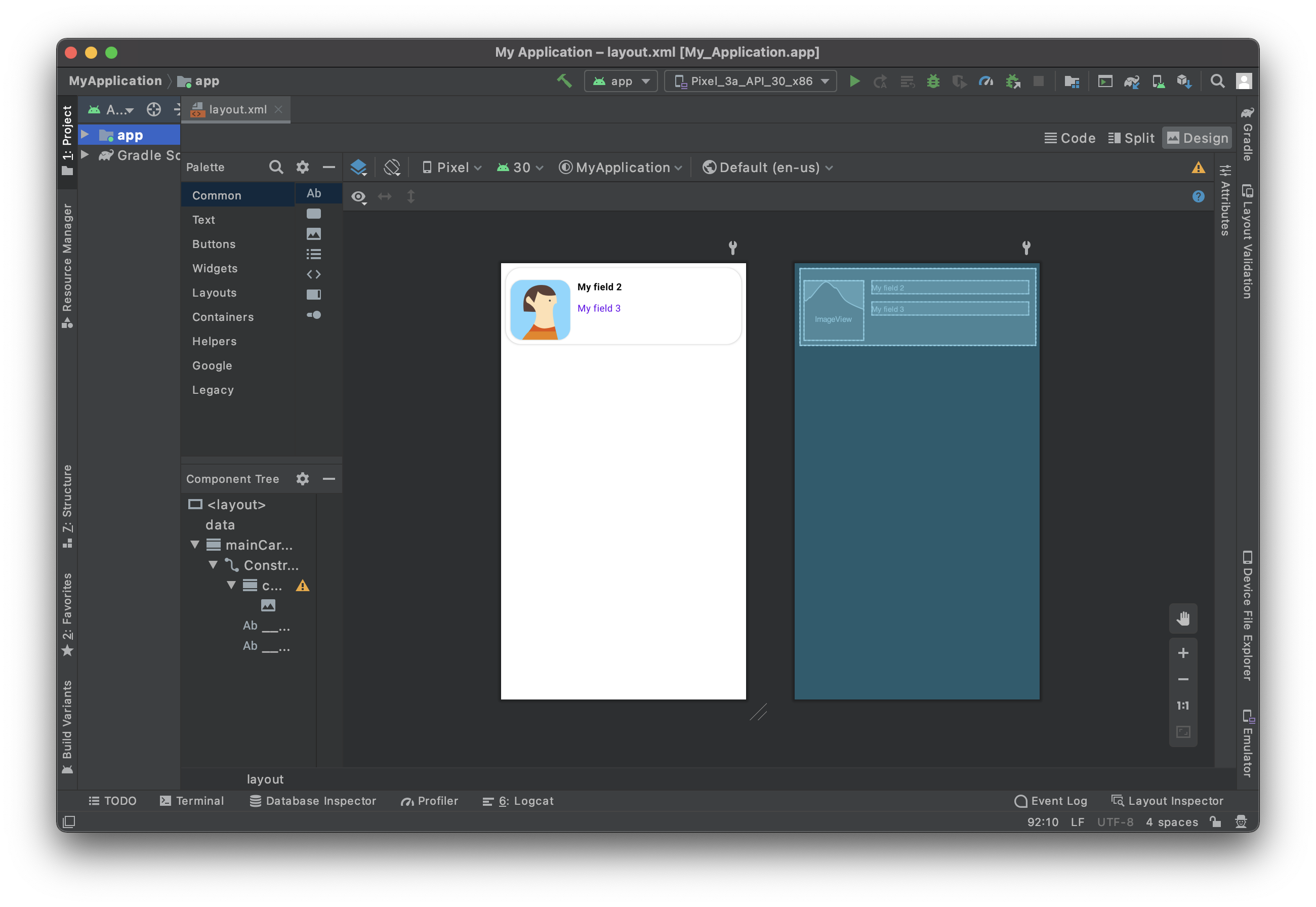
Your first list form template:
Here is the full layout code at this stage:
<?xml version="1.0" encoding="utf-8"?>

<layout xmlns:android="http://schemas.android.com/apk/res/android"
    xmlns:app="http://schemas.android.com/apk/res-auto"
    xmlns:tools="http://schemas.android.com/tools"
    tools:ignore="HardcodedText">

    <data>

        <!--ENTITY_VARIABLE-->
    </data>

    <androidx.cardview.widget.CardView
        android:id="@+id/mainCardview"
        android:layout_width="match_parent"
        android:layout_height="wrap_content"
        android:layout_marginStart="8dp"
        android:layout_marginTop="8dp"
        android:layout_marginEnd="8dp"
        android:layout_marginBottom="8dp"
        app:cardBackgroundColor="#FFFFFF"
        app:cardCornerRadius="25dp"
        app:layout_constraintBottom_toBottomOf="parent"
        app:layout_constraintEnd_toEndOf="parent"
        app:layout_constraintStart_toStartOf="parent"
        app:layout_constraintTop_toTopOf="parent">

    <androidx.constraintlayout.widget.ConstraintLayout
        android:layout_width="match_parent"
        android:layout_height="wrap_content">

        <androidx.cardview.widget.CardView
            android:id="@+id/cardView"
            android:layout_width="wrap_content"
            android:layout_height="wrap_content"
            android:layout_marginLeft="8dp"
            app:cardCornerRadius="20dp"
            app:layout_constraintStart_toStartOf="parent"
            app:layout_constraintTop_toTopOf="@id/__SPECIFIC_ID_2__">

        <ImageView
                android:id="@+id/__SPECIFIC_ID_1__"
                android:layout_width="100dp"
                android:layout_height="100dp"
                android:contentDescription="Image"
                app:imageUrl="__IMAGE_1__"
                tools:background="@tools:sample/avatars" />

        </androidx.cardview.widget.CardView>

        <TextView
            android:id="@+id/__SPECIFIC_ID_2__"
            android:layout_width="0dp"
            android:layout_height="wrap_content"
            android:layout_marginStart="12dp"
            android:layout_marginTop="20dp"
            android:layout_marginEnd="12dp"
            android:layout_marginBottom="6dp"
            android:scrollbars="none"
            android:text="__TEXT_2__"
            android:textAppearance="@style/TextAppearance.MaterialComponents.Body1"
            android:textColor="@color/black"
            android:textStyle="bold"
            app:layout_constraintEnd_toEndOf="parent"
            app:layout_constraintStart_toEndOf="@+id/cardView"
            app:layout_constraintTop_toTopOf="parent"
            app:layout_constraintBottom_toTopOf="@+id/__SPECIFIC_ID_3__"
            tools:text="My field 2" />

        <TextView
            android:id="@+id/__SPECIFIC_ID_3__"
            android:layout_width="0dp"
            android:layout_height="wrap_content"
            android:layout_marginStart="12dp"
            android:layout_marginTop="8dp"
            android:layout_marginEnd="12dp"
            android:layout_marginBottom="50dp"
            android:scrollbars="none"
            android:text="__TEXT_3__"
            android:textAppearance="@style/TextAppearance.MaterialComponents.Body1"
            android:textColor="?colorPrimary"
            app:layout_constraintBottom_toBottomOf="parent"
            app:layout_constraintEnd_toEndOf="parent"
            app:layout_constraintStart_toEndOf="@+id/cardView"
            app:layout_constraintTop_toBottomOf="@+id/__SPECIFIC_ID_2__"
            tools:text="My field 3" />

    </androidx.constraintlayout.widget.ConstraintLayout>

    </androidx.cardview.widget.CardView>

</layout>
Label customization
From here you can customize your label's :
color => android:textColor
weight => android:textStyle with normal, bold or italic possible values
appearance of your font => android:textAppearance
Try to keep consistency in your layout text sizes with appearance. The best way to achieve that is to follow the Material Design type.
For example, a basic TextView should be in @Body1@ scale.
android:textAppearance="@style/TextAppearance.MaterialComponents.Body1"
How to get data into your cells
Image View
In our list form template we used app:imageUrl="__IMAGE_1__"
Here we suppose the ImageView is the first view in the svg, and its view ID is __SPECIFIC_ID_1__.
If it would be the third view, it would be __IMAGE_3__ and its view ID would be __SPECIFIC_ID_3__.
Labels
In our list form template we used android:text="__TEXT_2__" for the title.
Here we suppose the title is the second view in the svg, and its view ID is __SPECIFIC_ID_2__.
Where to go from here?
In this tutorial, we've covered the basics for creating Android list form templates. You are now able to create simple templates on your own using the Starter Project ressources. But wait - there’s more! In the next tutorial, you’ll learn how to build Android detail form templates!
Download the completed template list folder: