Components
Components are the building blocks of your application.
Managing components#
Adding components#
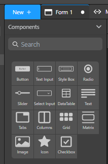
The Component library lets you search for a component or choose one from the list.
To add a component, drag it from the Components library section and drop it on the canvas.

Once a component is on the canvas, you can customize its look and bind a data source to it (if possible).
Tooltip#
When you select a component in the canvas, the tooltip displays its type and offers several actions:
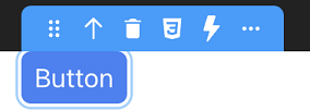
| Action | Description |
|---|---|
| Move | Moves the selected component on the canvas |
| Select Parent Component | Selects the parent component of the element. For example, selects the Text Input component when you click on its Label or Input part. |
| Delete component | Removes the selected component from the canvas |
| Export styles | Exports the overridden CSS properties to a new CSS class |
| Open Events panel | Opens the bottom panel, allowing you to bind events to the component |
| Copy, Cut, Paste, Paste into | Standard edit actions |
| Duplicate | Duplicates the component |
| Save as craft | Saves the component, its child components, and their styles as a reusable component named crafted component |
| Copy contents | Copies the contents of the component |
| Clear styles | Clears the styles of the selected element (resets the overridden CSS properties) |
| Clear Contents | Clears the contents of the component |
The tooltip is contextual, which means that some actions are available to certain elements, and not others. For example, you can duplicate a Text input component, but not its individual parts (Label and Input).
When you select some text in the Text component, additional actions are proposed in its tooltip.
Description of components#
Overview#
Two types of components are available:
- containers, which contain and organize other components
- data sources, components whose actions are bound to datasources
| Component | Type | Description |
|---|---|---|
| Button | data source | Triggers actions on a web page |
| Checkbox | data source | Allows the user to make a binary choice (boolean value) |
| Columns | data source | Displays data inside columns |
| Datatable | data source | Displays data in the form of a table. User can select a row to interact with the server |
| File input | data source | Allows you to upload a file to the server |
| Grid | data source | Allows you to produce complex and responsive layouts faster. Grid areas can be edited directly on the canvas |
| Icon | data source | Displays an icon |
| Image | data source | Displays an image |
| Matrix | container | Iterative. Container of repeated Styleboxes. Its Stylebox must have a fixed height set in pixels |
| Radio button | data source | Allows selecting one of a set of options |
| Range input | data source | Allows selecting a value in a range |
| Select box | data source | Iterative. Allows selecting an item in a list |
| Stylebox | container | Container used to keep the content centered and legible |
| Tabs | data source | Organizes and allows navigation between groups of content that are related and at the same level of hierarchy |
| Text | data source | Displays text on a web page |
| Text input | data source | Allows users to enter data in a form |
| Webform | container | Base container that holds all the other components |
| Webform loader | container | Displays a webform inside the current Webform component |
DataTable#
The DataTable component is designed to display data as a table from a datasource. Usually when a DataTable is bound to a catalog datasource, attributes are represented as columns, and entities are represented as rows. A DataTable also contains a header.
Basic features include column sorting, resizable columns, columns movable by drag and drop, tips display with cell value, and selectable/tabbable rows.
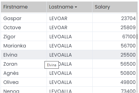
Note that all DataTable components parts are highly customizable thanks to a specific [CSS class].
The DataTable can be configured with the following properties, available from the Properties panel:
- Header height: Height of the header row in pixels.
- Row height: Height of each row (except the header) in pixels.
- columns area: Use this area to add, move, or remove colums from the DataTable.
- to add a column, click on the
+icon to display a new column configuration area at the bottom of the column list (see below) - to remove a column: click the trash icon of the column
- to move a column: select the icon at the left of the column name, then drag and drop the column.
- to add a column, click on the
- column name: Each added column is configured individually and has the following properties:
- Title: Column title to be displayed in the header and as column name in the properties area.
- Source: datasource for the column. Usually, it is an attribute whose value depends on each element of the DataTable's DataSource.
- Format: Display format for the column.
- Width: Column width in pixels. You can define the width in pixels or in percentage by using the unit menu at the right side of the entry area (PX or %)
- Sorting: Check this selector if you want that the user can sort the column by clicking the header area at runtime (alternatively for ascending/descending sort).
Styling#
The DataTable component supports dedicated CSS classes that allow customizing specific parts such as even columns or selected row. Refer to the Customizing DataTable Styles section for class definition and examples.
Events#
The DataTable component supports the following specific server event:
| Property | Type | Description |
|---|---|---|
| eventType | Text | "onheaderclick" |
| data | Object | - |
| index | Number | index of the clicked column header (starting from 0) |
| name | Text | the datasource of the column (i.e; address.city) |
File input#
The File input component provides a convenient way to upload files to the server. Thanks to this component, the user can upload a binary or a picture file and store it in an entity attribute.
A File input component is made of two elements (that you can select separately):
- a Label, usually displaying basic instructions such as "Please drop a file" (can be hidden)
- the File input area.
The File input area can be configured with the following properties, available in the Properties panel:
- Label position: relative position of the label regarding the file input area. You can also select hidden to not display a label.
- Size limit: maximum file size that the user will be allowed to upload. You can select the unit: KB, MB, GB. If the user selects a file with a larger size, an error is displayed on the browser.
- Media type: file type. Supported type: text, image, video, audio.
You must select an Entity datasource based upon an attribute of type Blob or picture to bind to the component. This attribute will be used to store the uploaded file.
Image#
The Image component displays an image in the webform.
You can upload an image to the studio and display it in your application. That image is available to all the webforms in your project and is stored in the Explorer panel > Shared > assets > images.
An uploaded image is displayed in the WebForm window when you select it in the images directory.
Matrix#
A matrix component displays a variable number of stylebox components (based upon the number of elements in the matrix's datasource). For example, you can display an entity selection using a matrix, where each included stylebox contains some attributes of the entity selection (text, images, etc).
The matrix is an iterative component. You can iterate on the matrix contents using the $This keyword.
Orientation#
A matrix automatically displays as many stylebox composents as possible in the defined height and width. You can select the orientation of the matrix, i.e. the order stylebox components are displayed and how they can be scrolled. Two options are available:
- Horizontal: stylebox components are ordered horizontally and a horizontal scrollbar is automatically displayed if necessary.
- Vertical (default): stylebox components are ordered vertically and a vertical scrollbar is automatic ally displayed if necessary.
Select box#
A select box component allows users to select an item from a list of stylebox components. A select box proposes the following properties:
- Placeholder:: text to display dimmed in the select box, for example "Select an activity"
- Number of items: maximum number of items to display simultaneously in the box
- Show length: display a string with the total number of items above the component in the web page. By defaut, the "{{ length }} items" is used, but you can customize this pattern in the area that appears when you select this option.
- Enable search: adds a search area in the web form, in which the user can enter characters to automatically filter the datasource contents displayed in the select box (the search is triggered on each key stroke).
When you select this option, a searchAttributes area is displayed so that you can define the datasource attribute(s) in which the entered string will be searched. Only attributes of type string or number can be searched.
Stylebox#
A stylebox component is a container that is used to keep the content centered and legible.
Styleboxes can be inserted at the root level of a webform, and can be nested to create a hierarchy of elements.
The following components automatically include a stylebox component that organizes their contents:
- columns,
- grid,
- tabs,
- matrix,
- select box.
For example, the matrix's stylebox is the first element of a matrix:
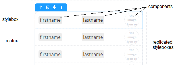
It is automatically replicated in the matrix area depending on its orientation and datasource:
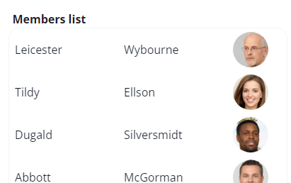
When you drag and drop a datasource attribute to a stylebox, a new Text component bound with the datasource is automatically created inside the stylebox:
| Datasource type | New text component bound with |
|---|---|
| Entity attribute | entity.attribute |
| Selection attribute | $iterator.attribute |
| Length of a selection | selection.length |
| Scalar datasource | datasourceName |
Text#
The Text component displays some text on the web page.
When you select some text in the Text component, additional actions are proposed in its tooltip:
- Style buttons: Applies style to the selected text: Bold, Italic, Underline, Strikethrough
- Toggle DataSource: Allows you to display the contents of a datasource as a text. It means that the text contents is defined dynamically by the datasource value. In Text you can insert a placeholder to display on the canvas, and in Datasource the datasource path (for example, "employer.name"). In an iterative component, use the
$Thiskeyword.
If you selected a datasource of type date, an additional Format area allows you to enter a date format pattern:
See this page on unicode.org for a detailed of available symbols and patterns. - Toggle Link: Allows you to insert a text label bound to an hypertext link. Select Open in a new tab if you want that the link be opened a new browser tab.
The link can be a static URL or a dynamic value based upon a datasource. For example, if the datasource is an object property, the property value is used as the URL.
Text input#
The Text input component allows users to enter data as text in the web form.
The Text input component supports a Type property with the following values:
- text: standard
- number: the user can only enter a number
- password: data entered is not displayed in clear<
- date: the user can only enter a date. A date picker is automatically displayed on the client when the user enters the form area.
Webform loader#
The Webform loader component displays a webform inside the current Webform component.
A Webform loader's initial value determines which webform it displays when it loads. You can set that initial value in one of the following ways:
- using the Properties panel
- by binding a local datasource of type Text to it and giving it an initial value.
If you apply both methods to the same Webform loader, the contents of the bound datasource are displayed in priority.
The initial value must match the name of the webform to display.
The difference between these methods is that binding a local datasource allows you to dynamically update the contents of the Webform loader. Every time the value of the datasource changes, the contents of the Webform loader are updated accordingly.
Server-side reference#
The server-side reference of a component is its "address" on the server. To set the behavior of a component, you can give it a server-side reference, and then use that reference in class functions.
To assign a server-side reference to a component, enter a value in the Properties panel > Server Side:
Crafted components#
You can craft your own components, that is, turn any component and its child components into a reusable component.
Any component can be saved as crafted component, except for the Webform component.
A crafted component includes the initial component's:
- styles, including CSS classes
- child components and their properties
- event configuration
- datasource references
How to craft a component#
- On the canvas, select the element you want to turn into a crafted component.
- In the Tooltip, click ... and select Save as craft.
- (Optional) Enter a name for the crafted component.
- Click Add.
The crafted component is now available in the Components > Crafted section and can be dragged and dropped on the Canvas.
Handling styles, datasources and events#
When you drop a crafted component on the Canvas:
- its CSS classes are imported into the target Webform, unless that Webform already has CSS classes with the same names.
- its datasources are not imported into the target webform. That's because crafted components only include references to datasources, not the datasources themselves.
- its event configuration is preserved, so you'll need to modify that configuration or make sure it matches the webform where you drop the crafted component.
Templates#
Templates are a great way to jump-start your building process. 4D Web Studio offers templates to help you design things more quickly. These templates come as-is and may require customization.
note
The current list of available templates is not representative of what will be available in the final product, and it will keep expanding.
To use a template:
- Open or create a new webform.
- In the Components section, click Templates.
- Select a template. A panel opens with several components to choose from.
- Choose a component you want to use and drag it from the list.
- Drop the component on the Canvas.